Category Archives: Uncategorized

Doc on the Bay

Blog_20110124_1

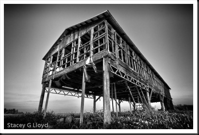
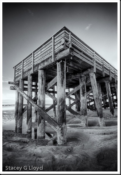
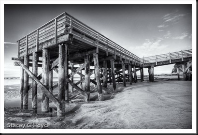
While staying at the beach recently, there was a nice dock across from the hotel. I spent one morning just exploring and working it from different places and perspectives. On top of it, below it, beside it, under it, etc. The lead image is one of many from that morning. If you remember my summer barn shots, there is a real similarity in look to this image.

Blog_20100729_2

This shows how shots you take where you live can help you better capture subjects when you are out at more distant locations.

Blog_20110124_1-3

As always, when you find a good subject, walk around, stick with it and work it. Don’t forget to use your camera both horizontally and vertically. It is so easy to get in the habit of using your camera only one way. If you want to see how strong your horizontal bias is, just look through your catalog of images – you will see what I mean.

Blog Image: These are all HDR images converted with Photomatix 4.0 and then post-processed with Silver Efx Pro.

Also posted in HDR Photography

Anniversary Missed

Eye See Art 

I realized the other day that I have now been writing this blog for over two years as of January. While this blog has meandered around a bit, the overall theme continues to be about creating photographic art wherever you live, work and play – “Photography Along the Way”. With the advent of all the small relatively  high resolution cameras and phones, like the iPhone, this is becoming even more true. Not only can you capture the image, but process it and post it from the field.

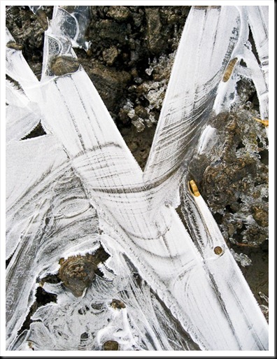
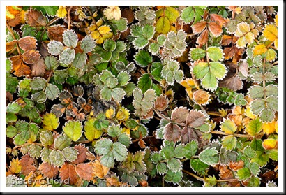
The blog image is an example of what you might find on a cold winter’s day; art that jumps out to you in its own unique way. You just need to stop, look and see.

Also posted in iPhoneography

When Skies are Gray

Surf in B&W

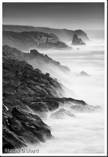
I was reading an image description on Darren White’s Flickr page the other day and he commented on how most of his Oregon coast images were in black and white. He noted that this was due to the fact that so many times the skies were cloudy and gray. This is often the case. In fact the day after I shot the images in my previous blog entry the skies were gray. Given that, I didn’t shoot as many images and I knew I would be processing them in B&W. What am I trying to say? Remember to adapt when the weather isn’t what you hoped for. Maybe you need to be seeing in B&W. Great images are still there to be captured.

Blog image: This is another long exposure image – 8 sec at f22 using a variable ND filter. In post processing, several things were done. A row of houses was removed from the far ridge using cloning (something I expected to do), the sky was darkened, foreground rocks were lightened and structure brought out in the water. Silver Efx Pro was used to convert and process the B&W image. I started with the high structure preset and added a red filter. I used a control point to bring out the far sea stack by adding contrast and darkening it. One thing I love in Silver Efx Pro is the “zone” bar that lets me see what portions of the image are in which tonal zone.

Beauty in the Mist

Blog_20110123_1-3

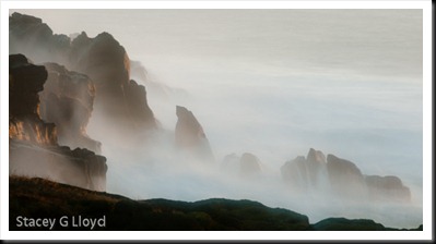
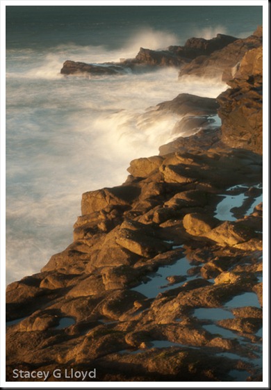
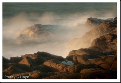
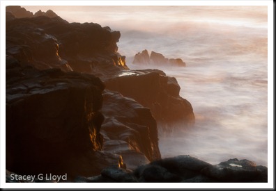
This past weekend my wife and I took a little get away and caught one of those rare sunny and warm January/February days on the Oregon coast. It was pleasant and there was really good wave action. As late afternoon came on with the ocean just past high tide the table was set for a beautiful evening shoot. I had been wanting to do more experiments with long exposures and so I put on my variable ND filter. The results are what you see here.

Blog_20110123_1-4

All of the exposures were 3-6 sec long at f22. While the images look very good at this size they aren’t quite as perfectly sharp as I would have liked. There was a strong wind that was creating quite a bit of vibration in the tripod and camera (even with a large Gitzo Systematic tripod). I was able to keep one hand on a tripod leg to damp out the vibration but there is still some there (didn’t have a good weight handy). The other thing that comes with wind by the ocean is a steady fine mist that gets on your filter all the time. I had to constantly clean the filter (have lots of micro clothes handy for these conditions).

Blog_20110123_1-7

As you may have noticed, I love to mix and blend colors within my images using movement – movement of the camera, textured glass, or the subject itself. This was just another way to get that mixing and the colors are wonderful.

Blog_20110123_4

Do you have a favorite?  Let me know.

Painters Tone Map

Blog_20101001_1

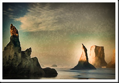
It struck me the other day as I walked through the Portland Art Museum that painters use tone mapping when they create their images. Look at a master landscape painter’s work and you will see what I mean. You can have a painting with the sun shining right at you, yet detail and light in areas that would be very dark to black if shot as a normal picture. The painter sees the full High Dynamic Range of light (as you and I do) and maps the tones as he desires into tones that he can show on a canvas. In some respects, HDR photography has now given that power to photographers.

Blog Image: Just for fun I decided to take an HDR image and make it look like some of the work I saw in the museum. This was a 5 exposure image from Bandon, Oregon. I processed it in a rather extreme fashion in HDR Efx Pro from Nik. This resulted in the bright glow around the stacks to the right. The landscape painters did that in their paintings to create a high contrast area that draws the eye. There is also detail in the stack to the left that wouldn’t be there in a single exposure image but could be in a painting. I then used Topaz Simplify to set to the “oil painting” preset to add the texture. For the final touches, I desaturated the image a little, shifted the white balance (to a bit warmer) and added a vignette.

Also posted in HDR Photography

Night Beat

Blog_20101206_1

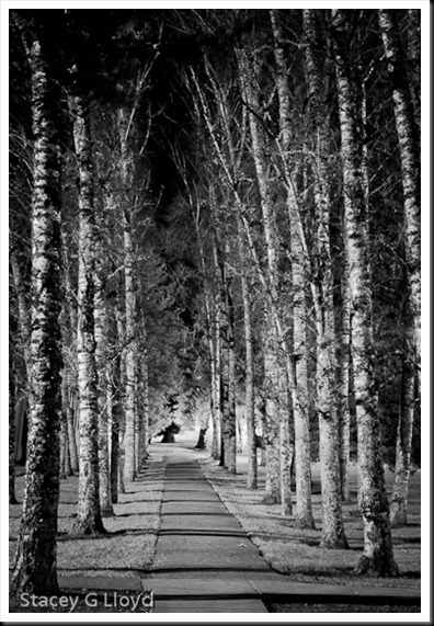
It is easy to get in the habit of only shooting pictures during the daytime. After all, isn’t photography all about capturing light? But even in the night, especially in the city, there is plenty of light to be found. While it can be challenging, it is also fun and you get to see things in a new way. You will definitely want a tripod and keep an eye on the histogram. 

Blog Image: I had been meaning to shoot this pathway many times this past year. But as I drove by it one night, I decided to stop then and there and get the shot. It was nice in the daytime, but it really popped with this nice nighttime side lighting. I converted the image to black and white using Nik’s Silver Efx Pro. This pathway is on the Pacific University campus in downtown Forest Grove.

Matting and Framing II

Blog_20110104_1

Picking up from the blog before last, here are some additional questions I have asked myself relative to the framing and matting of prints. Again, I have provided my choices, but in the end it is up to your taste, cost structure, etc.

  1. Color of the mat? This is a very debatable topic – color vs simple off white mats. I have chosen the off white to neutral color mat materials for all my images. I think it is easy to look unprofessional when you start mixing different color mats.
  2. Double mats? Double mats look nice, but add more cost. I have chosen to go with a faux double mat look. I saw this at an Ansel Adams print showing and I liked the look. To create this faux look you make your print area smaller then the mat opening (say 1/4” on each edge). The white print area around the print combined with the mat gives it that double mat look.  The tradeoff is that it is a bit more tedious to line up the print as you mount it in the mat.
  3. Mat thickness? When you start looking at mat material you will find there are multiple thicknesses to choose from – 4,6 and 8 ply being the most common. Here I base the decision on the size of the print, whether it is a Special Edition or Limited Edition and sale price. For the larger, high end prints I use 6 or 8 ply mat. For the smaller Special Edition prints I use 4 ply. I can tell you that 8 ply looks really nice. One reason to use thicker mats for larger prints is that it keeps the print surface from ever touching the glass (it might stick).
  4. Frame material? There are several choices for frame material: metal, wood, none, etc. So far I have chosen to go with wood frames. Metal is typically cheaper, but I personally prefer the look of wood. You can also choose to go with something like canvas wrapped prints (something that happens to be in right now).
  5. Frame color? Black is a classic – especially for black and white images.  For my color images, I prefer a warm medium to dark wood tone.
  6. Dust seal? You may first be asking yourself what is a dust seal. It is the brown paper backing you see on professional framed artwork. I choose to do this for my Limited Edition high end framed prints. Generally this requires that you use wood frames – you glue the paper (when it is damp) to the frame itself.
  7. Frame hanger? Again here there are several choices. A wire attached to the frame with D-ring hangers is the high end choice. If you are going to hang in a gallery – this is the preferred choice.

I am sure you may have yet more questions. If you do, feel free to ask them on this blog.

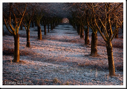
Blog image: A sunrise shot of a frost laden orchard near my home.

iPhoneography Along the Way

 2_Stacey_  

I know I promised part two of my blog on Framing and Matting, but before I do, I just wanted to share a little more iPhonegraphy (as it is being called). For me iPhoneogrphy is just another way to create images along the way and where you are at – that is my overall primary message in this blog. iPhones just provide a convenient way to have a reasonable quality camera with you all the time.

1_Stacey_

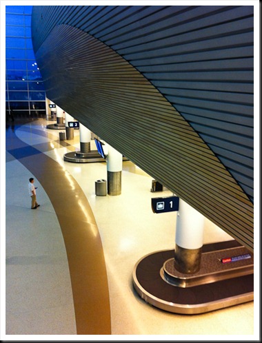
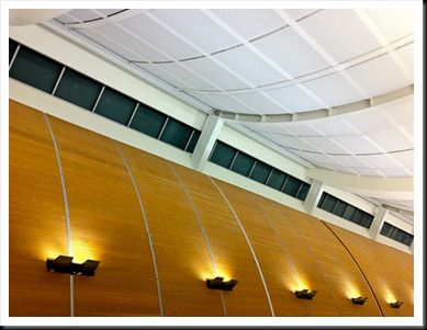
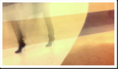
This past week I arrived a bit early at the San Jose airport on a return trip home. Not having my camera gear with me I decided to make the best of it and shoot a few iPhone images. I have included a couple here.

3_Stacey_

Blog Images:

  1. I waited a bit on this first image for people to be in good locations – balanced. In this case I got lucky and only one person was left facing into the scene – click!
  2. Looking up, I liked the lines and colors of this cool ceiling. I framed the picture to create a strong diagonal and keep and odd number of lights.
  3. The last two images I played with the “Slow Shutter” app again and with 1-2 sec shots took images of people’s feet stepping in and out of the frame. The patterns in the flooring allowed me to create interesting backgrounds. I braced the iPhone against a pillar, but wasn’t able to keep the background as sharp as I would have liked (needed a tripod). None the less the images came out very intriguing.

4_Stacey_

Also posted in iPhoneography

Matting and Framing

Blog_20110103_1-2 This blog entry is for those who like it when I touch on the practical side of selling and marketing your images.

Inevitably as you start to look at selling prints, you have to ask, what sizes should I print? Should I matt them? Frame them? How? I know I had all these questions and a lot more as I started to sell prints. It took me a while to come to some conclusions on a lot of this so here are a few of my decisions:

  1. I have personally chosen to only use mats and matting materials that are archive quality, acid free, cotton rag, etc. They aren’t the cheapest way to go, but I want my work to last and be a quality product all around. I use archive pigment inks and papers so I don’t want the matting materials ruining the print in time.
  2. I try to use standard size mats to keep the cost down. Custom sizes cost more or require you to cut your own.
  3. I have chosen so far not to cut my own mats. While that would allow more options and a custom look, I am choosing not to spend my time this way. You may choose differently. I use mats with 1:1, 6:4 and 2:1 ratio openings.
  4. If I am selling matted prints. I choose mats whose outside dimensions fit off the shelf frame sizes when possible – this keeps the customers additional cost down when they buy my prints.
  5. I typically buy my mats from matt providers like matcutter.com or framedestination.com . They are quick and so far they both provide quality work.

Here are more questions you will likely have:

  1. How thick of a mat? 4,6 or 8 ply.
  2. Should you double mat?
  3. What color mat should you use?
  4. Frame material and color?

I’ll touch on these and more in my next blog entry (or more).

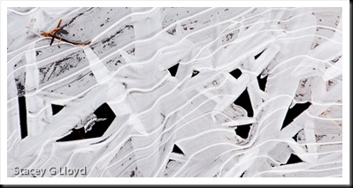
Blog image: Another shot from one of the recent cold mornings. Ice on the edge of a pond. Nice oblique movement and interesting pattern of dark and lights. Cropped to a 2:1 ratio format.

Frosty Mornings

Blog_20110103_1

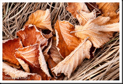
Frosty mornings can present you with a lot of photographic material. With the recent cold snap in the NW I have taken the opportunity to get out a couple of mornings for some frosty shoots – once in the yard and a couple times out in the local areal. Frosty leaves and flora are a classic and I just can’t get enough of them.

What am I looking for when shooting frosted leaves or plants?

  1. Nice color – rich subtle hues or bright  primaries.
  2. Simple compositional elements – oblique lines, circles, triangles, etc. without random crossing lines (like those caused by blades of grass). You might have to do a little finger pruning.
  3. Are the corners filled or balanced and symmetrical?
  4. Geometric pattern of color or just nice balance?
  5. Is there a single element that draws the eye within the apparent chaos?
  6. Nice frost.

Blog_20110101_1

Applying these to the blog images here is what we see in the first image:

  1. Rich brown tones.
  2. Diagonal composition formed by the leaves.
  3. The corners are symmetrical. If there were leaves in three corners and only one with grass it would feel unbalanced.
  4. Balanced with triangle in the corners.
  5. For me the leaf near the upper right attracted my eye.

For the second image (this will look nice as a large print):

  1. Beautiful mix of orange, yellow and green.
  2. No real strong compositional element but a strong repeated pattern. No rogue grass blades, twigs,etc.
  3. All corners are filled.
  4. The individual colors are evenly spread throughout the image maintaining balance. Look at each color and see the balance.
  5. For me the lighter green leaf cluster near the upper right caught my eye.

Was I thinking about all of this while shooting the images? Actually I was. It is pretty automatic now due to experience.