More Tapestries

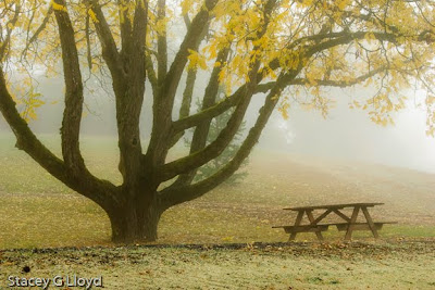
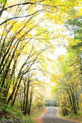
I have been busy the last few days working on new images for my “Fall Tapestries” portfolio. For this project the number of images is restricted to 10 image total. It has been quite difficult trying to edit down to that limit -which images should be added and removed to create more depth while maintaining or increasing the overall quality of the set. I have included some of the candidates here in the blog.

Posted in Uncategorized

Symbolism in Composition

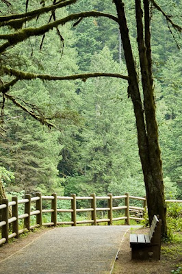
Besides the use of lines, perspective, color, etc. to achieve emotional impact in you image, one can use symbolism. For example, one that is commonly used is an empty chair or seat. I find that it can have a different impact depending on the surrounding context. I have included images that illustrate this. The first image from a mausoleum has a couple symbolic elements. For now we will focus on the empty bench. Here the bench helps convey the sense of loss – something/someone missing.

The second and third images present much more pleasant surroundings. I have found these images make the viewer wish they were sitting there and really draws the viewer into the image. Sometimes an empty bench may make the viewer feel loneliness.
Going back to the first image, let us analyze it a bit more:

  1. Empty seat symbolism – loss.
  2. Wilted roses – reinforces the idea of death.
  3. Color – the color in the roses grabs the viewer’s eye. The lack of color in the rest of the image again creates a sense of loss, subdues the mood, etc.
  4. Lines on the granite wall lead you from the roses back to the empty bench.
  5. Light – the brighter light on the bench highlights the empty bench and may five a sense of hope to some.

What are some other strong symbolic elements you have seen used? Note, that some symbols may have emotional ties for you but not others.

Posted in Uncategorized

Photography Books, etc

In case you have noticed, I added an Amazon widget on my blog. It contains and will only contain books that I own and have read (for the most part – some don’t lend themselves to straight reads – more like references). The first book I will point out is “The Photographer’s Eye” by Michael Freeman. Its an excellent book on composition and touches on some areas not often discussed – the shape of your image (the frame) for one. Personally I have felt that second to developing an eye for light, is the development of an eye for composition.
Blog image: nice morning shot of Mount Hood on a misty fall morning. Illustrates the compositional technique of layering or repetition.
Posted in Uncategorized

Fall Immersions

There has continued to be quite a response to my two blogs on photographing for emotional impact. Because of that I will be coming back to that topic soon with discussions on how the different aspects of composition convey emotion – framing, subject placement, focal length, etc. So stay tuned if that is of interest to you.

In the meantime, I have been working on additions to my impressionistic images this fall, in addition to the “Fall Tapestry” images I posted a couple blogs ago. I have tentatively call this portfolio – Fall Immersions. The blog image is one of my favorites. Immerse yourself in the colors of fall and enjoy the images (click on the image to see others in this portfolio).
Posted in Uncategorized

More Emotional Impact

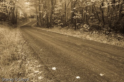
It appears my last blog entry on emotional impact in photography struck a cord with many of you out there. So in that same line, I have added two more images taken at the same time as the previous 3 images that take yet different approaches to the subject.

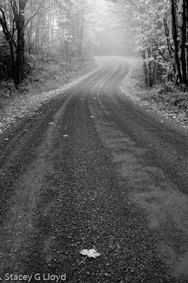
The first image is similar in feel to the third one in my previous blog, but is a bit different. For me it conveys the emotion of being left behind. How about you? Analysing the image:
  1. Not really hi or low key – just average tonal range – maybe a touch on the dark side.
  2. Wide angle lens – gives is that since of distance from the foreground leaf to the curve.
  3. Road line is more straight up and down – less dynamic or exciting than a diagonal. This is in keeping with the more subdued (or negative) emotion.
  4. Foreground object close to front frame edge (not at the classic 1/3 location). This reinforces the left behind or loneliness of the image.
  5. Black and white image – again less vibrant and more subdued.

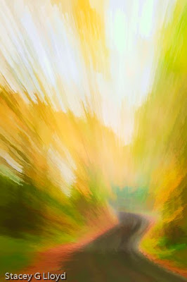
The second image was shot while zooming and panning using a long shutter exposure. The panning was to keep the end of the road as the zoom focal point. It has been blended in Photoshop with a “watercolor” version generated with Topaz Labs Simplify. What feelings does this rendition of the image illicit?

Posted in Uncategorized

Photographing for Emotional Impact

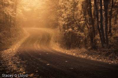
Really good photographs not only present a technically fine image to the viewer, but they should have emotional impact. I have included in this blog three images shot within minutes of each other of the same subject, each designed and processed for a different emotional impact.

The first image is designed to covey the joy of a walk down a country road on a fall day. Lets look at some of the factors that create that impact:
  1. Hi key image (somewhat) – highlights are allowed to blow out and the majority of the tones are on the lighter end of the scale. This creates an airy uplifting feeling.
  2. Vertical lines – the vertical lines of the tree have positive impact (as compared to horizontal ones).
  3. Diagonalsdiagonal lines create energy and a sense of movement. The trees are at a slight diagonal in this image.
  4. Vertical framing – a vertical frame like any vertical lines in the image reinforces the positive feel.
The second image has a more subdued, moody and mysterious feel. Analysing this image:
  1. Low key image – most of the image is to the dark side – creating moodiness.
  2. Horizontal frame – horizontal lines or framing can make an image more subdued and tranquil.
  3. Post processed to emphasize the fog – fog adds mystery.
  4. Monochromatic – eliminating the bright fall colors again creates a more subdued retrospective image.
  5. Curved road – a path or road that disappears around a bend creates a sense of mystery. “What lies ahead?”

The third image conveys different emotions (shot again at the same time as the others). What do you feel when you look at it?

Posted in Uncategorized

Fall Tapestries

I just thought I would share with you a set of images I created the past couple of weeks for a portfolio, “Fall Tapestries”. Click on the opening image to see the full set of images.
A tapestry is “A heavy cloth woven with rich, often varicolored designs or scenes…”. The earliest known Western tapestries were woven in the tranquil seclusion of monasteries by the devout seeking to beautify the house of God. Over time the art of tapestry making became one of the major visual art forms along side painting and sculpting. My tapestries seek to capture that finely woven design of color that permeates nature and reveals the infinitely artistic hand of the creator – from the intricate intermixing of the colors in the forest to the varicolored designs of the leaf.
Posted in Uncategorized

Money in Fine Art Photography?

As I continue to look at how one can make a living in fine art photography, I have come to some conclusions.

Very, very few fine art photographers make their living primarily off of selling prints. One photographer in the NW indicated he only knew of 3-4 in the entire NW region who were able to do that. So in general I would say as a fine art photographer you need to look at generating multiple streams of income – books, teaching (online, DVDs and/or direct), lectures, etc.

It takes a long time to build up a following and income stream. Have you ever noticed how often it takes an artist in most any genera 10+ years to be recognized? The key here is to just keep plugging along and making the most of opportunities as they come along, getting your name out there.

One thing that does mark some of those that succeed is a specialization in a technique, subject or skill that isn’t easily replicated by the mass of other photographers out there. In business terms they have established a significant barrier to entry to their particular markets. The current turmoil in the photographic market place is in my mind due to the lowering of the barrier to entry that existed before the age of digital photography and the digital age. The digital age has allowed a much greater number of people to create good images and distribute them in a prolific manner. One result of this proliferation has been that to stand out as a photographer you must figure out how to rise above the masses. While the Internet has created the opportunity for visibility around the world – standing out in all this “noise” is difficult (think about searching on the web – how many hits do you get if you sea ch on “photographer”).

Stock photography as a major source of income is pretty much dead. While I hear rumors of a photographer now an then who still makes a living off stock, the professional fine art photographers I know would say not to waste your time there now. So far I have not had any success in the more direct sales approach to calendar companies and publishers either. This could be due to the economy, my lack of experience in selling to them or my images may not match their needs (though I try to do my research here). Time will tell.

So am I throwing in the towel. No. I am just sharing my observations along the way. Being persistent definitely seems to be a key to success.

Feel free to share your thoughts and experiences in making money in fine art photography.

Posted in Uncategorized

More on Fall Photography

I decided to add on a couple more hints on fall photography and how to ratchet things up a bit more.
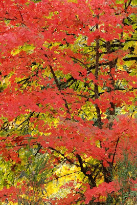
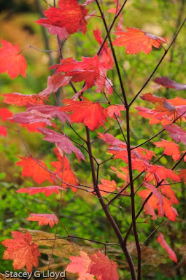
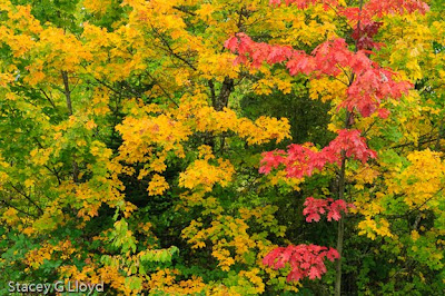
  1. When shooting images of fall trees, look for patterns in the color. Patterns give your image more structure and our brains like patterns. You will be surprised how many times there will be horizontal line or layers of color. I have included a couple of examples here – first two images.
  2. Look for back lit leaves and trees when the sun is out. The glow from back light can be quite spectacular and make a tree standout from the background. See next image.
A couple more advanced techniques useful in fall photography:

  1. Use of double exposures to add more “glow”. This can be done in camera, using for instance Nikon’s overlay function, or in Photoshop post processing by stacking layers. To create the glow you see in the blog image I used an in camera overlay where the first image was in sharp focus and the 2nd one out of focus and overexposed 1-stop. I then blended them to taste using the in camera gain controls.
  2. Use camera pans or swipes to blend colors and create great fall abstracts. Here you slow down your shutter speed to 1/5-1/8 second and move your camera while taking the picture (it is fun to break rules!). Try it several times until you get an image you like. It is generally best (but not a rule) to move your camera along the primary lines in the image – typically up and down for trees. The last blog image is an example of this. For more on this see http://staceyglloyd.blogspot.com/2009/07/pans-and-swipes.html.

Have fun with fall shooting.

Posted in Uncategorized

Fall Photography

It is that beautiful time of year known as fall. One of those times when the world becomes a candy store for a photographer. There are images waiting to be captured everywhere it seems. But how many times have you gotten your fall photographs back and they just don’t capture the magic. Well here are a few tips I have learned over the years:

  1. Use a polarizer to bring out those colors and remove that washed out glare from the sky (even on a cloudy day). This is one filter effect you can’t recreate afterwards in Photoshop. If you want fall colors with deep blue skies you need this filter. All of the blog images where shot with a poloarizer.
  2. Shoot on a cloudy day right after the rain – the colors are very saturated under these conditions, but again make sure you use a polarizer to get the glare off those wet leaves. See above image.
  3. Underexpose a little in some cases (1/3 – 1 stop) – underexposure saturates colors.
  4. Look for a splash of one color surrounded by another to create impact. See first blog image.
  5. Look for structure to hang your fall colors on. See next image.
  6. Windy day – experiment with long exposures. The next image was shot at 1.6 sec to allow the wind to create the fall “fire”.

As always have fun!

Posted in Uncategorized