Painters Tone Map

Blog_20101001_1

It struck me the other day as I walked through the Portland Art Museum that painters use tone mapping when they create their images. Look at a master landscape painter’s work and you will see what I mean. You can have a painting with the sun shining right at you, yet detail and light in areas that would be very dark to black if shot as a normal picture. The painter sees the full High Dynamic Range of light (as you and I do) and maps the tones as he desires into tones that he can show on a canvas. In some respects, HDR photography has now given that power to photographers.

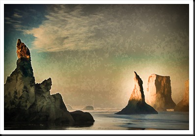
Blog Image: Just for fun I decided to take an HDR image and make it look like some of the work I saw in the museum. This was a 5 exposure image from Bandon, Oregon. I processed it in a rather extreme fashion in HDR Efx Pro from Nik. This resulted in the bright glow around the stacks to the right. The landscape painters did that in their paintings to create a high contrast area that draws the eye. There is also detail in the stack to the left that wouldn’t be there in a single exposure image but could be in a painting. I then used Topaz Simplify to set to the “oil painting” preset to add the texture. For the final touches, I desaturated the image a little, shifted the white balance (to a bit warmer) and added a vignette.

Posted in HDR Photography, Uncategorized

Night Beat

Blog_20101206_1

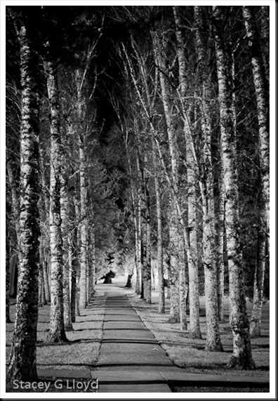
It is easy to get in the habit of only shooting pictures during the daytime. After all, isn’t photography all about capturing light? But even in the night, especially in the city, there is plenty of light to be found. While it can be challenging, it is also fun and you get to see things in a new way. You will definitely want a tripod and keep an eye on the histogram. 

Blog Image: I had been meaning to shoot this pathway many times this past year. But as I drove by it one night, I decided to stop then and there and get the shot. It was nice in the daytime, but it really popped with this nice nighttime side lighting. I converted the image to black and white using Nik’s Silver Efx Pro. This pathway is on the Pacific University campus in downtown Forest Grove.

Posted in Uncategorized

Matting and Framing II

Blog_20110104_1

Picking up from the blog before last, here are some additional questions I have asked myself relative to the framing and matting of prints. Again, I have provided my choices, but in the end it is up to your taste, cost structure, etc.

  1. Color of the mat? This is a very debatable topic – color vs simple off white mats. I have chosen the off white to neutral color mat materials for all my images. I think it is easy to look unprofessional when you start mixing different color mats.
  2. Double mats? Double mats look nice, but add more cost. I have chosen to go with a faux double mat look. I saw this at an Ansel Adams print showing and I liked the look. To create this faux look you make your print area smaller then the mat opening (say 1/4” on each edge). The white print area around the print combined with the mat gives it that double mat look.  The tradeoff is that it is a bit more tedious to line up the print as you mount it in the mat.
  3. Mat thickness? When you start looking at mat material you will find there are multiple thicknesses to choose from – 4,6 and 8 ply being the most common. Here I base the decision on the size of the print, whether it is a Special Edition or Limited Edition and sale price. For the larger, high end prints I use 6 or 8 ply mat. For the smaller Special Edition prints I use 4 ply. I can tell you that 8 ply looks really nice. One reason to use thicker mats for larger prints is that it keeps the print surface from ever touching the glass (it might stick).
  4. Frame material? There are several choices for frame material: metal, wood, none, etc. So far I have chosen to go with wood frames. Metal is typically cheaper, but I personally prefer the look of wood. You can also choose to go with something like canvas wrapped prints (something that happens to be in right now).
  5. Frame color? Black is a classic – especially for black and white images.  For my color images, I prefer a warm medium to dark wood tone.
  6. Dust seal? You may first be asking yourself what is a dust seal. It is the brown paper backing you see on professional framed artwork. I choose to do this for my Limited Edition high end framed prints. Generally this requires that you use wood frames – you glue the paper (when it is damp) to the frame itself.
  7. Frame hanger? Again here there are several choices. A wire attached to the frame with D-ring hangers is the high end choice. If you are going to hang in a gallery – this is the preferred choice.

I am sure you may have yet more questions. If you do, feel free to ask them on this blog.

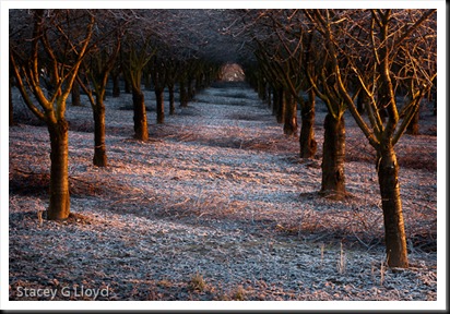
Blog image: A sunrise shot of a frost laden orchard near my home.

Posted in Uncategorized

iPhoneography Along the Way

 2_Stacey_  

I know I promised part two of my blog on Framing and Matting, but before I do, I just wanted to share a little more iPhonegraphy (as it is being called). For me iPhoneogrphy is just another way to create images along the way and where you are at – that is my overall primary message in this blog. iPhones just provide a convenient way to have a reasonable quality camera with you all the time.

1_Stacey_

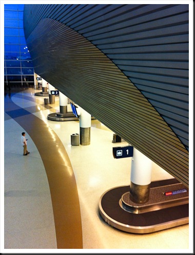
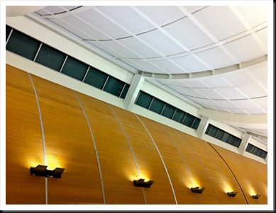
This past week I arrived a bit early at the San Jose airport on a return trip home. Not having my camera gear with me I decided to make the best of it and shoot a few iPhone images. I have included a couple here.

3_Stacey_

Blog Images:

  1. I waited a bit on this first image for people to be in good locations – balanced. In this case I got lucky and only one person was left facing into the scene – click!
  2. Looking up, I liked the lines and colors of this cool ceiling. I framed the picture to create a strong diagonal and keep and odd number of lights.
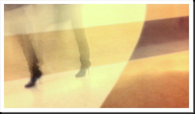
  3. The last two images I played with the “Slow Shutter” app again and with 1-2 sec shots took images of people’s feet stepping in and out of the frame. The patterns in the flooring allowed me to create interesting backgrounds. I braced the iPhone against a pillar, but wasn’t able to keep the background as sharp as I would have liked (needed a tripod). None the less the images came out very intriguing.

4_Stacey_

Posted in iPhoneography, Uncategorized

Matting and Framing

Blog_20110103_1-2 This blog entry is for those who like it when I touch on the practical side of selling and marketing your images.

Inevitably as you start to look at selling prints, you have to ask, what sizes should I print? Should I matt them? Frame them? How? I know I had all these questions and a lot more as I started to sell prints. It took me a while to come to some conclusions on a lot of this so here are a few of my decisions:

  1. I have personally chosen to only use mats and matting materials that are archive quality, acid free, cotton rag, etc. They aren’t the cheapest way to go, but I want my work to last and be a quality product all around. I use archive pigment inks and papers so I don’t want the matting materials ruining the print in time.
  2. I try to use standard size mats to keep the cost down. Custom sizes cost more or require you to cut your own.
  3. I have chosen so far not to cut my own mats. While that would allow more options and a custom look, I am choosing not to spend my time this way. You may choose differently. I use mats with 1:1, 6:4 and 2:1 ratio openings.
  4. If I am selling matted prints. I choose mats whose outside dimensions fit off the shelf frame sizes when possible – this keeps the customers additional cost down when they buy my prints.
  5. I typically buy my mats from matt providers like matcutter.com or framedestination.com . They are quick and so far they both provide quality work.

Here are more questions you will likely have:

  1. How thick of a mat? 4,6 or 8 ply.
  2. Should you double mat?
  3. What color mat should you use?
  4. Frame material and color?

I’ll touch on these and more in my next blog entry (or more).

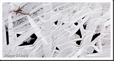
Blog image: Another shot from one of the recent cold mornings. Ice on the edge of a pond. Nice oblique movement and interesting pattern of dark and lights. Cropped to a 2:1 ratio format.

Posted in Uncategorized

Frosty Mornings

Blog_20110103_1

Frosty mornings can present you with a lot of photographic material. With the recent cold snap in the NW I have taken the opportunity to get out a couple of mornings for some frosty shoots – once in the yard and a couple times out in the local areal. Frosty leaves and flora are a classic and I just can’t get enough of them.

What am I looking for when shooting frosted leaves or plants?

  1. Nice color – rich subtle hues or bright  primaries.
  2. Simple compositional elements – oblique lines, circles, triangles, etc. without random crossing lines (like those caused by blades of grass). You might have to do a little finger pruning.
  3. Are the corners filled or balanced and symmetrical?
  4. Geometric pattern of color or just nice balance?
  5. Is there a single element that draws the eye within the apparent chaos?
  6. Nice frost.

Blog_20110101_1

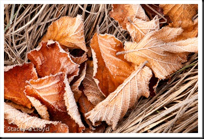
Applying these to the blog images here is what we see in the first image:

  1. Rich brown tones.
  2. Diagonal composition formed by the leaves.
  3. The corners are symmetrical. If there were leaves in three corners and only one with grass it would feel unbalanced.
  4. Balanced with triangle in the corners.
  5. For me the leaf near the upper right attracted my eye.

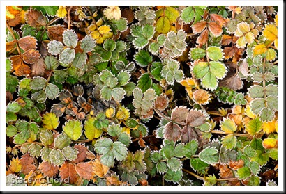
For the second image (this will look nice as a large print):

  1. Beautiful mix of orange, yellow and green.
  2. No real strong compositional element but a strong repeated pattern. No rogue grass blades, twigs,etc.
  3. All corners are filled.
  4. The individual colors are evenly spread throughout the image maintaining balance. Look at each color and see the balance.
  5. For me the lighter green leaf cluster near the upper right caught my eye.

Was I thinking about all of this while shooting the images? Actually I was. It is pretty automatic now due to experience.

Posted in Uncategorized

Happy New Year! – Notan

Blog_20101227_1-2 

Thought I would get out a last minute Happy New Year to all of my readers out there. To start off the year I decided to write about notan.  Not nothing but notan.

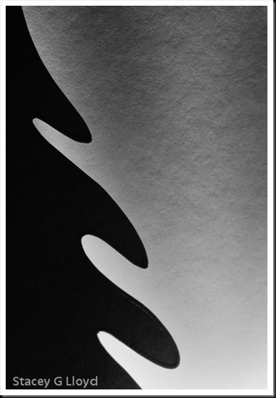
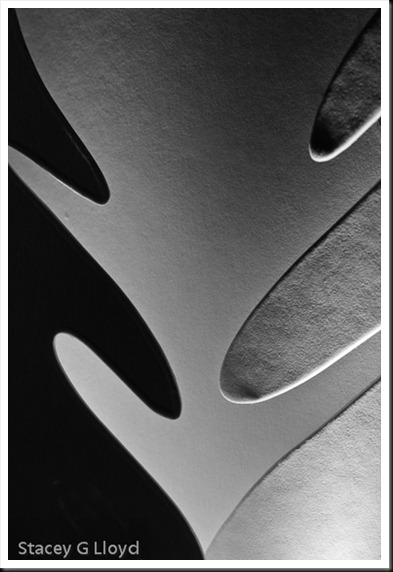
Notan is “a Japanese design concept involving the play and placement of light and dark next to each other in art…”. Or as it was put in a new book I was reading, Photographic Composition A Visual Guide, “The importance of negative space (ground) being seen as having shape and being harmonious with shapes in positive space (figure)”. The yin-yang symbol is a classic example. As in these two abstract blog images, neither the figure or ground (subject or background) are dominant and they balance each other.

Blog_20101227_1-4

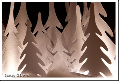
These images were created from a Christmas decoration setting on our fireplace mantle. Having just read about notan these images came to mind as I stared at the decoration. The decoration is shown from a wider perspective below.

Blog_20101227_1-3

Another place to find notan material is in shadows. If the sun is shining where you live, go out and look for the interplay of dark and light on a sidewalk, see what you can find.

Posted in Uncategorized

Seeing Anywhere (w/iPhoneography)

Blog_20101228_1-9

I started this morning reading a quote from Ernst Hass,”The camera doesn’t make a bit of difference. All of them can record what you are seeing. But, you have to see “.

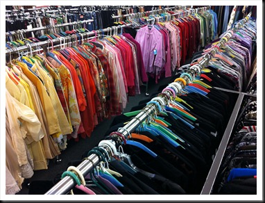
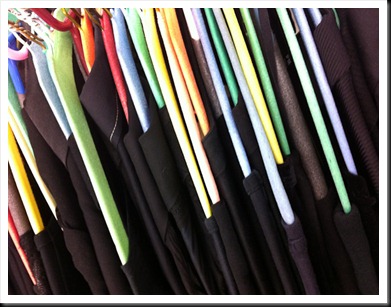
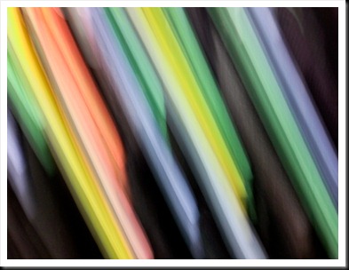
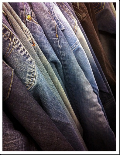
Later I was accompanying my wife and daughter to a clothing store. Not having much to look at myself, I started to see the palettes of color around me. Thinking of a new app, “Slow Shutter” (I had just loaded it on my iPhone), I decided to play with the colors around me and create color abstracts using iPhone pans and swipes.

This is what was there:

Blog_20101228_1-5

The opening blog image and those that follow are what I “saw”.

Blog_20101228_2

Blog_20101228_1-8

Blog_20101228_1-3

Blog_20101228_1-2

This next image was created from several black tops hanging on different color hangers. Again you can see what was there and then what I saw. Now you may say, how can one “see” those things? The answer is simply imagination, practice and experience. I  looked for pleasing color schemes, individual colors mixed with opposites, used oblique lines for more energy, etc.

Blog_20101228_1-4

Blog_20101228_4

Was all I saw abstract colors? No. Here are a couple more images from that store visit. One indoors and the other out waiting in the truck.

Blog_20101228_1-6

Blog_20101228_1-7

Blog images: As noted above the first images were all created using an iPhone with the “Slow Shutter” app. For the images here I varied the shutter speed from 1/4sec to 4sec. In some cases I just moved the camera up and down or along the dominant lines, in others, I would twist the camera while moving it forward or backward (with the  longer shutter speeds). I tried a variety of motions seeing what patterns I could create.

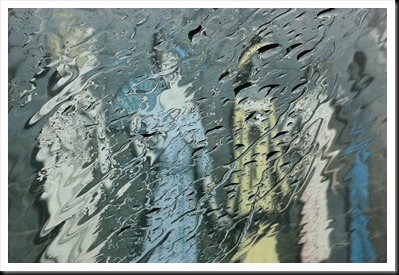
The last two images are straight shots using the standard iPhone camera app, the later being shot through a rain drenched window.

Posted in iPhoneography, Uncategorized

Power of the Oblique

Blue Moon at Night

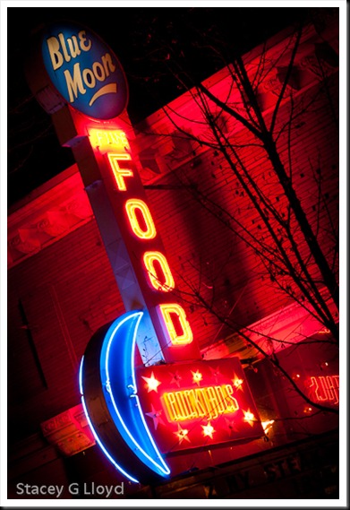
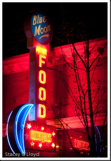
While out shooting nighttime shots this past week I was reminded of the power of using oblique angles when composing an image. Look at the two blog images. The subject was interesting, but a straight up and down composition was less than exciting. Is this an original idea for a neon sign? No. But it definitely made this image have a lot more punch.

Blog_20101223_1

Blog Images: This was shot in downtown McMinnville Oregon while I was HDR Christmas window shopping. These are not HDR images – didn’t really need the wide luminance range. All adjustments were done in Lightroom 3.2. Both images were burned and dodged in basically the same way for comparison purposes.

Posted in Uncategorized

All About the Eyes

Blog_20100515_1 

Just a quick blog entry with a couple of shooting tips for the holidays. As you gather with your families during this holiday season and maybe take some family pictures, remember the eyes. When people view an image they are immediately drawn to faces. And specifically the viewer will focus in on the eyes. So if you’re shooting with your DSLR and maybe a large aperture in a dimly lit room, remember that the eyes need to be in focus.

Personally I try to use flash as little as possible and take advantage of window light. Open the drapes and let whatever light is outdoors flow into the room. Catch people when then are facing a window. Get in there, get intimate shots. Have fun and don’t sweat it. Use a flash if you need it – sharp with flash is better than blurred without.

By all means put down the camera at some point and just be there – you know what I mean.

Happy Holiday, Merry Christmas and a Happy New Year to everyone!

Posted in Uncategorized