Category Archives: Texture Overlay

More Flypaper Texture Overlays

Blog_20100304_2

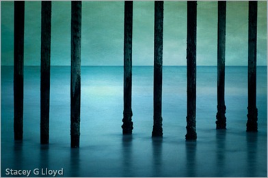
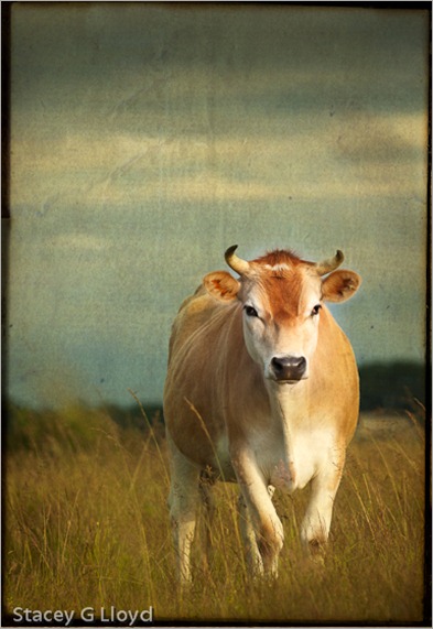
Life is keeping me busy right now so before I continuing with the next installment on composition, I thought I would share some more images I have created lately using Flypaper Textures.

Blog_20110313_1

As you can see texture overlays work on a wide variety of subjects. Here are a couple quick observations:

  1. Subjects with subtle or non-cluttered backgrounds tend to work best.
  2. Try multiple textures on an image to see what works best.
  3. Try several of the Photoshop layer blending modes. I use multiply and soft light the most (so far).
  4. Vary the opacity of the blending modes.
  5. Apply multiple textures to a single image.
  6. Use masks to vary intensity of texture in areas of the image. Having minimal (to no) texture on the key focal points tends to work well.

Blog_20100621_1

Have fun!

Also posted in How To

Fall Color and Textures

Blog_20111104_1-4

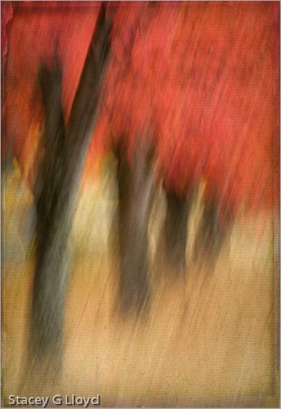
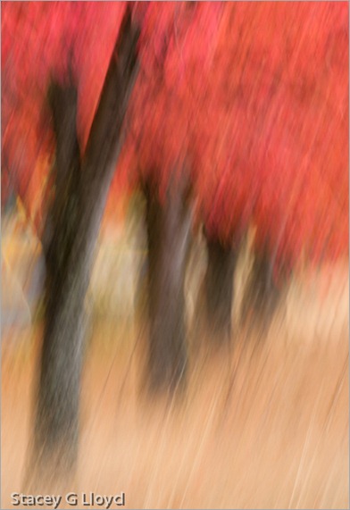
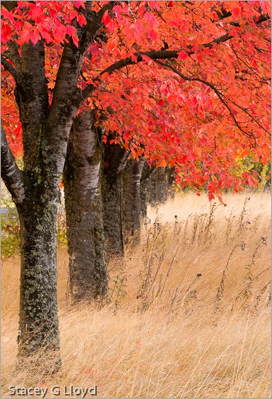
It is hard to believe that fall has come and almost gone. This past year has gone so quickly. I not only love the bright colors of fall, but all the various shades of brown the grasses and plant take on. As always, I try different techniques on any good subject I find. This row of maple trees in an abandoned business park is one example. The opening blog image was created from a swipe (1/4 sec) that then had two texture overlay layers added. Both textures are Flypaper textures. Shown below is the swipe without the added texture layers.

Blog_20111104_1

The third image is the scene shot straight at f22 for maximum depth of field.

Blog_20111104_1-3

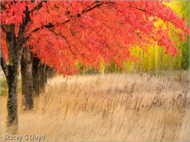
The final image is a landscape format capture of the scene that brings in more of the green in the distance trees. Shooting both landscape and portrait orientations of a subject is always a good idea; that gives you more options for possible publication or stock image use. I find I like each of these images for different reasons. Which do you like best?

Blog_20111104_1-2

Also posted in Uncategorized

Flypaper Textures

Blog_20100730_1-2

In the past couple of years, the use of “texture overlays” has become quite popular (see Flickr).  Personally they appeal to me because of the painterly quality added to an image. Up until now I have only used textures that I have captured. Typically I have grabbed the texture on location (a close-up of a building’s texture for overlay on other images of the building). However, I have seen some beautiful images from Tony Sweet, John Barclay and others that use prepackaged texture images from “Flypaper Textures”. They offer several differ sets of textures which can be purchased. The quality of these textures is excellent and multiple textures can be applied to an image to make it unique. I highly recommend them.

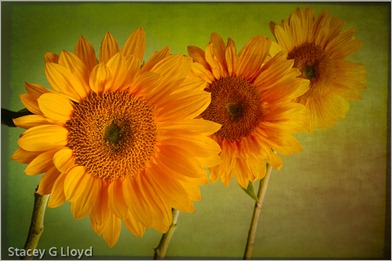
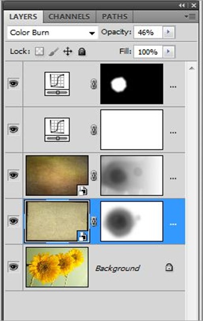
Textures can be overlaid with an image using various tools, but the most common is simply using a layer stack in Photoshop as shown below. For the sunflower image I used two different Flypaper textures. First I added the “Antiquity Scroll” texture from the Flypaper Texture Box Two collection. I blended it with the primary image using the Color Burn mode at 46% opacity to get the look I wanted. Next I added a mask to that layer and removed most of the texture from the first sunflower. Secondly I added the “Muscatel” texture from that same collection. I blended this second texture using the Multiply mode at 100% opacity.  Again I added a mask  and removed most of the texture from the left most sunflower and some from the center flower. Third, I performed an overall curves adjustment to the stack; the image was a bit dark and low in contrast. Finally, I enhanced the contrast of the left most sunflowers center using selective application of a curves layer.

How do you know what textures to use or which blending mode to use? Basically you need to experiment. Try different textures, opacities, blending modes and masks. There are also several tutorial blog entries on the Flypaper Texture Blog.

PS Layer Stack

Also posted in How To

Texture Overlay

Blog_20110922_1-5

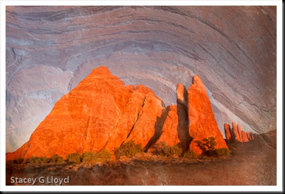
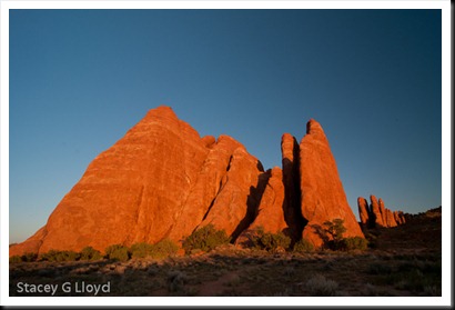
When I am out in the field shooting, I try to remember to capture close ups as well as the big picture; get that nitty gritty detail. These close-ups can come in handy later for creating what are known as texture overlays. The image here is a blend of two images taken on my recent outing in Colorado and Utah. The rock structure shown below was taken at Arches National Park at sunset.

Blog_20110922_1-2

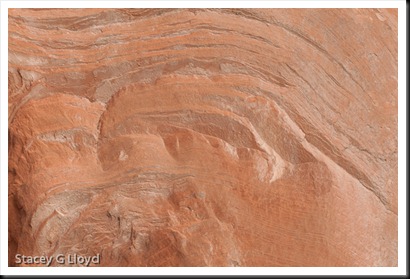
The close-up texture was taken in the Colorado National Monument. It is shown below.

Blog_20110922_1-3

As I was reviewing the images I noticed the similarity in the contours. One thing I should mention about shooting the texture image: I try to be conscience of the composition formed by the lines or key elements in the texture (often using the rule of thirds). I try to apply the same vision to the composition as I would for any other image.  I find that my texture images often work well with my other images as a result (common eye).

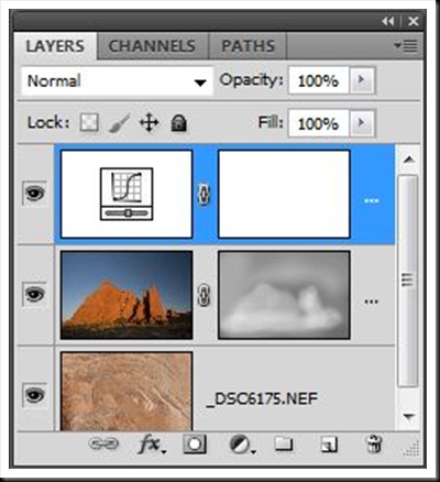
The final image is created by blending the two originals together in Photoshop using a mask layer shaded to taste by using a pen tablet. See the screen capture below. As shown, a curve adjustment was used as well to get the desired contrast in the final image.

Layers

Also posted in How To