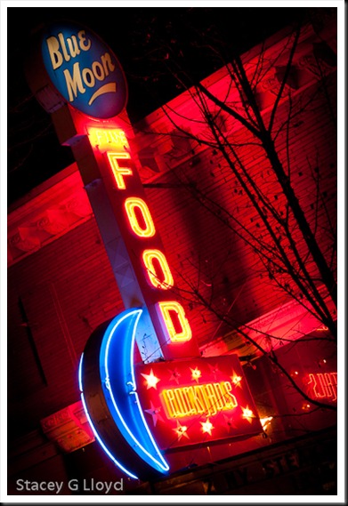
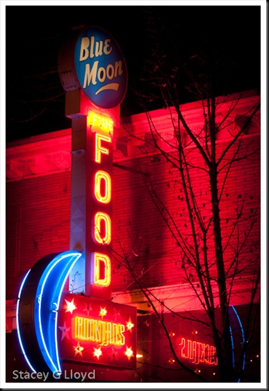
While out shooting nighttime shots this past week I was reminded of the power of using oblique angles when composing an image. Look at the two blog images. The subject was interesting, but a straight up and down composition was less than exciting. Is this an original idea for a neon sign? No. But it definitely made this image have a lot more punch.
Blog Images: This was shot in downtown McMinnville Oregon while I was HDR Christmas window shopping. These are not HDR images – didn’t really need the wide luminance range. All adjustments were done in Lightroom 3.2. Both images were burned and dodged in basically the same way for comparison purposes.


