Monthly Archives: December 2011

Coming Soon

Blog_1

As you may have noticed I have been away from the blog longer than usual. There are several reasons for this: the busyness of the holidays, a death in the family and work on a new combined blog/website.

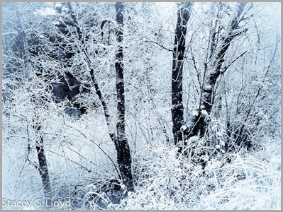
The blog image was captured with an iPhone. While driving to a car shop, my wife and I accidently stumbled across a small area where there was a local “hoar” frost. It was absolutely stunning. A mile or two in either direction there as nothing. I didn’t have my main camera gear (shame on me) so I got out the iPhone and grabbed a couple of images. I added a bit of a white vignette to give it that out the window look . In addition I converted it to a selenium toned image (to add the cold blue hue).

Posted in Uncategorized

Composition Notes – Balance

Blog_20111114_1-3

For the second in the series on composition, I thought I would touch on balance. One could write pages on this subject so I will only scratch the surface. Balance in some ways is one of the trickier aspects of composition. When is an image balanced? Should it be balanced? What factors come into determining visual balance? This blog only touches on the last question.

Don’t confuse symmetry with balance. Creating symmetry can be good in some images, but symmetry can often result in static or “boring” images. You can have balance without image symmetry.

Key to understanding balance is the fact that our mind implicitly gives weight to elements within an image. This weight is not just based on the elements size, but on it’s color, tonal value, local contrast, texture or other differences from the rest of the elements, etc.

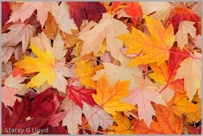
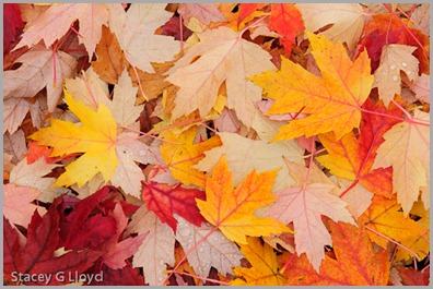
Look at the opening blog entry versus the one below. Do you feel the difference? What is the difference?

Blog_20111114_1-4

It isn’t much, but the difference is the one red leaf along the top middle left edge of the image. First, red as a color carries a lot of weight – our eye is quickly drawn to red elements (notice in this image that the yellow leaves feel somehow secondary). Second, the red leaf helps balance the red leaves around the rest of the frame. In part this is done by completing a pattern. The red leaves almost form a circle (or possible a triangle) around the yellow ones.  When the one red leaf is gone it’s absence breaks the pattern and draws our mind’s eye. Our mind doesn’t like it when it can’t find a pattern that provides balance and goes off hunting. Completing the circle keeps our eye in the frame and on the subject.

Looking at the three primary yellow leaves in the image. Do you feel the balance? They are all different sizes but there is balance. One way to look at it is a teeter tauter (fulcrum). From the visual center formed by the three leaves note that the smaller leaf on the left is further from the center than the larger on the right. This gives balance around the “middle” leaf (just like we learned as children on the teeter tauter).

Looking back at the blog on “black holes” we can see that the black hole creates an imbalance because of its strong tonal weight. The same is true of white spots in an image.

I will leave you with one last image to think about. Look at the black and white image below. It has “black holes” all over the place. Why does it work? What gives the two asymmetric leaf clusters balance?

Hydrangea in Black and White

Posted in Composition

More Flypaper Texture Overlays

Blog_20100304_2

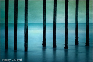
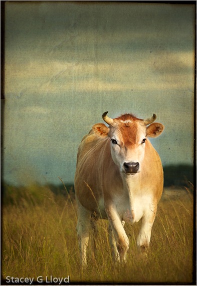
Life is keeping me busy right now so before I continuing with the next installment on composition, I thought I would share some more images I have created lately using Flypaper Textures.

Blog_20110313_1

As you can see texture overlays work on a wide variety of subjects. Here are a couple quick observations:

  1. Subjects with subtle or non-cluttered backgrounds tend to work best.
  2. Try multiple textures on an image to see what works best.
  3. Try several of the Photoshop layer blending modes. I use multiply and soft light the most (so far).
  4. Vary the opacity of the blending modes.
  5. Apply multiple textures to a single image.
  6. Use masks to vary intensity of texture in areas of the image. Having minimal (to no) texture on the key focal points tends to work well.

Blog_20100621_1

Have fun!

Posted in How To, Texture Overlay