Monthly Archives: October 2011

Flypaper Textures

Blog_20100730_1-2

In the past couple of years, the use of “texture overlays” has become quite popular (see Flickr).  Personally they appeal to me because of the painterly quality added to an image. Up until now I have only used textures that I have captured. Typically I have grabbed the texture on location (a close-up of a building’s texture for overlay on other images of the building). However, I have seen some beautiful images from Tony Sweet, John Barclay and others that use prepackaged texture images from “Flypaper Textures”. They offer several differ sets of textures which can be purchased. The quality of these textures is excellent and multiple textures can be applied to an image to make it unique. I highly recommend them.

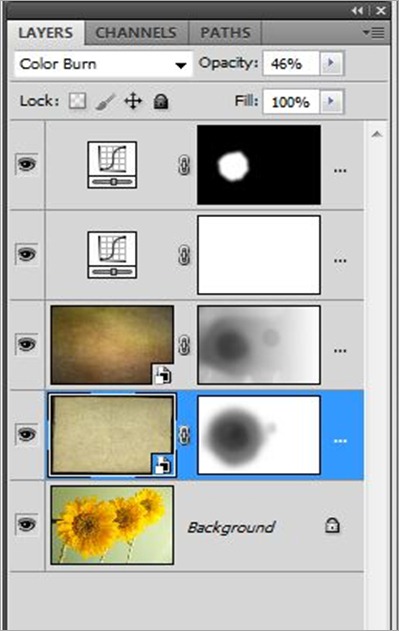
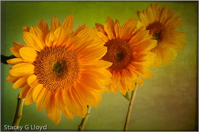
Textures can be overlaid with an image using various tools, but the most common is simply using a layer stack in Photoshop as shown below. For the sunflower image I used two different Flypaper textures. First I added the “Antiquity Scroll” texture from the Flypaper Texture Box Two collection. I blended it with the primary image using the Color Burn mode at 46% opacity to get the look I wanted. Next I added a mask to that layer and removed most of the texture from the first sunflower. Secondly I added the “Muscatel” texture from that same collection. I blended this second texture using the Multiply mode at 100% opacity.  Again I added a mask  and removed most of the texture from the left most sunflower and some from the center flower. Third, I performed an overall curves adjustment to the stack; the image was a bit dark and low in contrast. Finally, I enhanced the contrast of the left most sunflowers center using selective application of a curves layer.

How do you know what textures to use or which blending mode to use? Basically you need to experiment. Try different textures, opacities, blending modes and masks. There are also several tutorial blog entries on the Flypaper Texture Blog.

PS Layer Stack

Posted in How To, Texture Overlay

First Articles Published

Blog_20111018_1

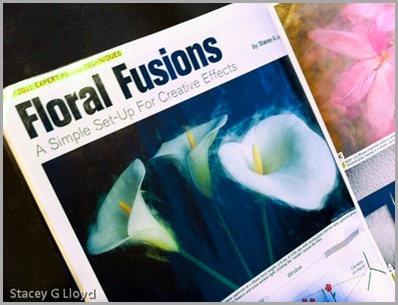
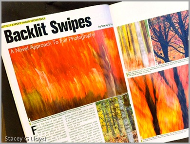
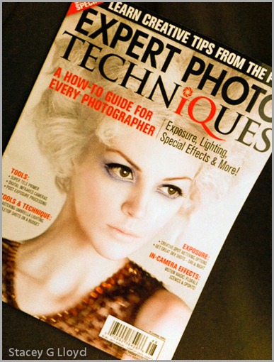
Excuse my shameful self promotion here, but it is exciting to get your first article(s) published in a national publication. In this case Shutterbug’s Special “Expert Photo Techniques”  (the cover is shown in the last blog image). The first two images are iPhone captures of the lead pages for each of the two articles. If you have been following my blog you know that both of these articles are based on work you would have seen here first.

Blog_20111018_2

In case I didn’t mention it before, these two articles were written several months apart but just happened to be put in the same issue by the editor. Both of them are “how to” articles on creating some of the images shown in my exhibit earlier this year.

If you want to pick up your own copy, you can generally find this special issue wherever Shutterbug magazine is sold. Enjoy.

Blog_20111022_3

Posted in Uncategorized

Fort Point in HDR – Revisited

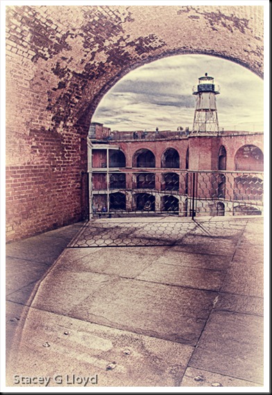
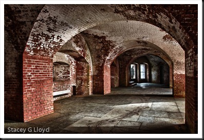
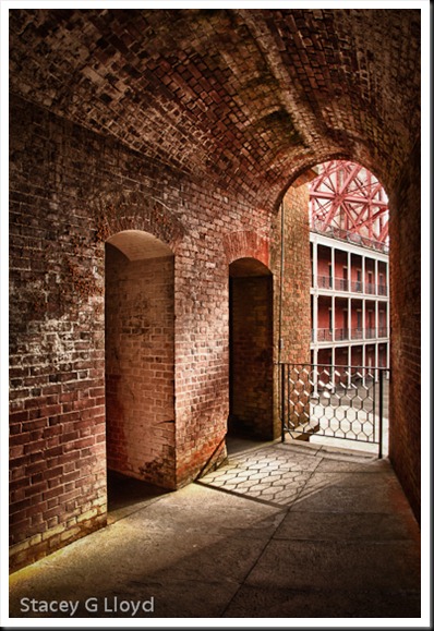
Blog_20111003_2 This past week I was able to return to Fort Point in San Francisco. Unfortunately, due to traffic I only had a 45 minute window in which to shoot before it closed. Here are a couple of images from that visit. It was a great place to photograph the first time and was again the second. If you can go there, I highly recommend it. It is the lighting that excites me when I am there; very dramatic with wonderful arches, lines and shadows everywhere. As before, I shot HDR sets to deal with the extreme light range.

Blog_20111003_1 One thing I decided after my first visit was that this place begs for people in the images. I made use of my camera’s timer to take some images where I ran out into the frame. In the image above, that is me in the window. I shot one medium exposure frame in addition to the HDR set where I stood on the steps by the window. I then blended myself into the HDR image using Photoshop layers and a mask. It looks like I am outside the window, but I am not.

Blog_20111003_3

All HDR images processed with HDR Efx Pro from Niksoftware. Additional processing was done in PS5 with other Nik Filters.

Posted in HDR Photography, Uncategorized

Texture Overlay

Blog_20110922_1-5

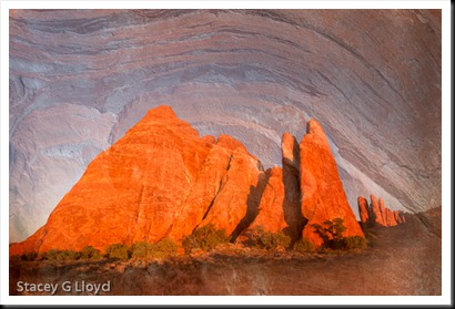
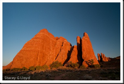
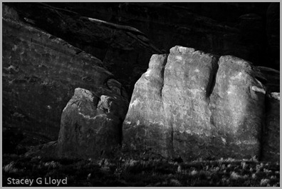
When I am out in the field shooting, I try to remember to capture close ups as well as the big picture; get that nitty gritty detail. These close-ups can come in handy later for creating what are known as texture overlays. The image here is a blend of two images taken on my recent outing in Colorado and Utah. The rock structure shown below was taken at Arches National Park at sunset.

Blog_20110922_1-2

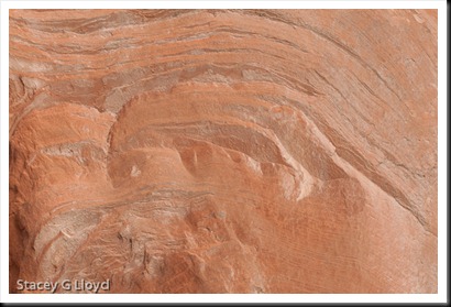
The close-up texture was taken in the Colorado National Monument. It is shown below.

Blog_20110922_1-3

As I was reviewing the images I noticed the similarity in the contours. One thing I should mention about shooting the texture image: I try to be conscience of the composition formed by the lines or key elements in the texture (often using the rule of thirds). I try to apply the same vision to the composition as I would for any other image.  I find that my texture images often work well with my other images as a result (common eye).

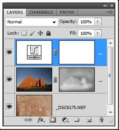
The final image is created by blending the two originals together in Photoshop using a mask layer shaded to taste by using a pen tablet. See the screen capture below. As shown, a curve adjustment was used as well to get the desired contrast in the final image.

Layers

Posted in How To, Texture Overlay

More of Nature’s Spotlights

Blog_20110919_1

I thought I would share more images where nature created natural spotlights that highlighted key elements in the image. In creating strong images second only to composition is the quality of light. Again most of these are from my recent trip to Colorado and Utah. The image above is one of my favorites.

Blog_20110913_1

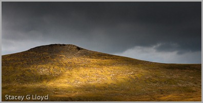
The image above would not be that strong without the natural spotlight on the side of the hill. It is that light that caught my attention. While the rock peaks of Rocky Mountain National Park were around me, it was this special light on the hill behind me that made it stand out. This is an example of why it is always good to be looking all around you when you are shooting; especially if the lighting is fairly dynamic.

Blog_20110922_1

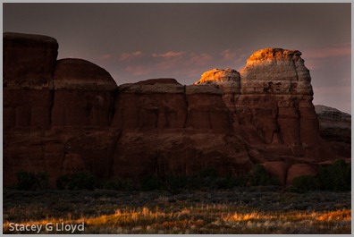
The last rays of a sunset highlighted the tops of the rock structures captured above making them standout against the background.

Blog_20110922_1

As in the previous image, the last sun rays before sunset touched the top of this structure and highlighted the grass along the foreground.

Posted in Uncategorized