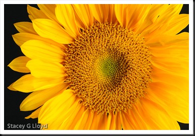
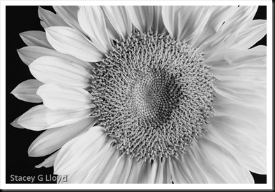
You may have noticed that I like to work (play) with a lot of different techniques in my photography; both in the capture and post-processing. However there are times when keeping everything simple just seems best. This is one of the reasons I like a lot of William Neill’s images. The blog image is one example of my keeping it simple. I have also included it in Black and White.
One of the keys to “simple” is simply great light. Another is just simple composition – think simple graphics.
So if you are like me, and like to push the limits, step back now and then and keep it is simple.


