New Year – New Combined Blog/Website

Blog_20110225_1

As you can see I have unified my blog and website. Hopefully you will find the new site easier to navigate. If you hit problems or have other feedback, let me know. I have decided to go with a lighter, minimalistic look built around the WordPress CMS using a Photocrati theme.

Here are a couple things to note on the website.

  1. There is a new resource tab where I will be listing websites of interest, my videos, and other useful resources for aspiring photographers.
  2. In the lower right hand corner I will be listing new changes to the website – gallery updates, new videos, etc.
  3. In the lower left hand corner is a list of the most recent blog entries.
  4. In the lower center will be a list of coming events: articles, lectures, shows, etc.
  5. If you want to purchase prints go to the purchase tab. Images or galleries have been (and will be) set up for purchase via PayPal there.
  6. There is a new “Category” list on the blog page where I will categorize new and older posts as another way to find blog entries of interest.

Keep visiting in the coming weeks as I will continue to make refinements and add new content to my website. For those of you reading my blog via a reader, RSS feed, etc. let me know if you would like some service set up or are having problems. I am looking into ways to automatically migrate some of you.

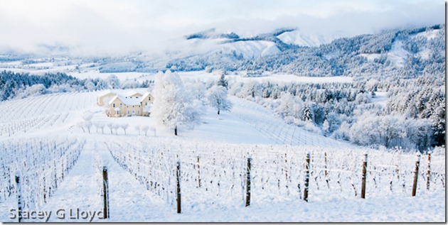
Blog Image: One of the advantages of this new blog is my ability to better present wide format images like the one above of the David Hill Vineyard.

Posted in Uncategorized

Coming Soon

Blog_1

As you may have noticed I have been away from the blog longer than usual. There are several reasons for this: the busyness of the holidays, a death in the family and work on a new combined blog/website.

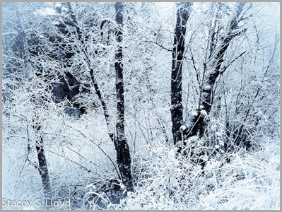
The blog image was captured with an iPhone. While driving to a car shop, my wife and I accidently stumbled across a small area where there was a local “hoar” frost. It was absolutely stunning. A mile or two in either direction there as nothing. I didn’t have my main camera gear (shame on me) so I got out the iPhone and grabbed a couple of images. I added a bit of a white vignette to give it that out the window look . In addition I converted it to a selenium toned image (to add the cold blue hue).

Posted in Uncategorized

Composition Notes – Balance

Blog_20111114_1-3

For the second in the series on composition, I thought I would touch on balance. One could write pages on this subject so I will only scratch the surface. Balance in some ways is one of the trickier aspects of composition. When is an image balanced? Should it be balanced? What factors come into determining visual balance? This blog only touches on the last question.

Don’t confuse symmetry with balance. Creating symmetry can be good in some images, but symmetry can often result in static or “boring” images. You can have balance without image symmetry.

Key to understanding balance is the fact that our mind implicitly gives weight to elements within an image. This weight is not just based on the elements size, but on it’s color, tonal value, local contrast, texture or other differences from the rest of the elements, etc.

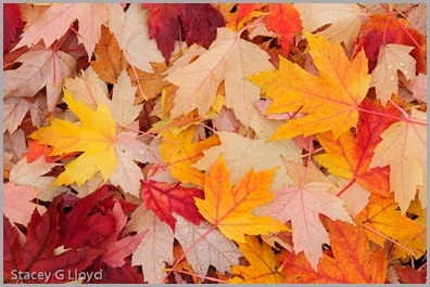
Look at the opening blog entry versus the one below. Do you feel the difference? What is the difference?

Blog_20111114_1-4

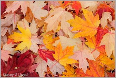
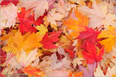
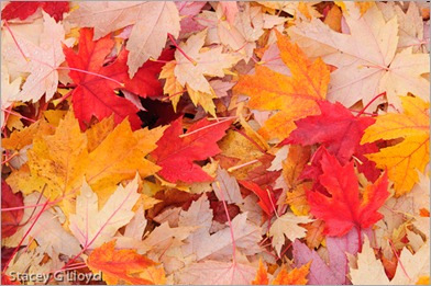
It isn’t much, but the difference is the one red leaf along the top middle left edge of the image. First, red as a color carries a lot of weight – our eye is quickly drawn to red elements (notice in this image that the yellow leaves feel somehow secondary). Second, the red leaf helps balance the red leaves around the rest of the frame. In part this is done by completing a pattern. The red leaves almost form a circle (or possible a triangle) around the yellow ones.  When the one red leaf is gone it’s absence breaks the pattern and draws our mind’s eye. Our mind doesn’t like it when it can’t find a pattern that provides balance and goes off hunting. Completing the circle keeps our eye in the frame and on the subject.

Looking at the three primary yellow leaves in the image. Do you feel the balance? They are all different sizes but there is balance. One way to look at it is a teeter tauter (fulcrum). From the visual center formed by the three leaves note that the smaller leaf on the left is further from the center than the larger on the right. This gives balance around the “middle” leaf (just like we learned as children on the teeter tauter).

Looking back at the blog on “black holes” we can see that the black hole creates an imbalance because of its strong tonal weight. The same is true of white spots in an image.

I will leave you with one last image to think about. Look at the black and white image below. It has “black holes” all over the place. Why does it work? What gives the two asymmetric leaf clusters balance?

Hydrangea in Black and White

Posted in Composition

More Flypaper Texture Overlays

Blog_20100304_2

Life is keeping me busy right now so before I continuing with the next installment on composition, I thought I would share some more images I have created lately using Flypaper Textures.

Blog_20110313_1

As you can see texture overlays work on a wide variety of subjects. Here are a couple quick observations:

  1. Subjects with subtle or non-cluttered backgrounds tend to work best.
  2. Try multiple textures on an image to see what works best.
  3. Try several of the Photoshop layer blending modes. I use multiply and soft light the most (so far).
  4. Vary the opacity of the blending modes.
  5. Apply multiple textures to a single image.
  6. Use masks to vary intensity of texture in areas of the image. Having minimal (to no) texture on the key focal points tends to work well.

Blog_20100621_1

Have fun!

Posted in How To, Texture Overlay

Composition Notes – Black holes

Blog_20111114_1-2

While shooting the fallen leaves this past weekend, I decided to use them to illustrate some of the compositional elements I take into account while shooting. This is the first in a set of blog entries touching on composition. First i will look at black holes.

Blog_20111114_1

Take a look at the second image. Notice where your eye gets drawn – the black area in the middle upper left. That probably isn’t where you want the viewer to look. Compare this to the opening blog image where I simply placed a leaf in the hole – problem solved.

Ways of dealing with “black holes”

  1. Fill the hole as I did above.
  2. Shift the framing to eliminate the black hole.
  3. In post processing try to bring out detail in the hole by dodging it (increase local exposure).
  4. Clone something into the hole during post processing.
  5. Use the black holes or “negative” space as part of the composition – balance. I will touch on balance in a future blog.

Black holes are often a problem when shooting foliage and flowers, etc. This is especially true on sunny days where there are deep dark shadows. That is why cloudy days are often better for shooting these subjects (use a diffuser or look for shade on a sunny one). So instead of “dealing” with the black holes, you can avoid them altogether.

Posted in Composition

Leaf Recycling

Blog_20111114_1-4

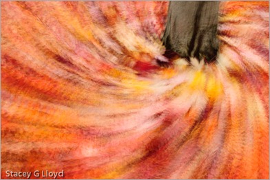
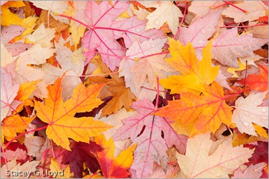
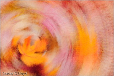
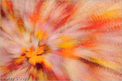
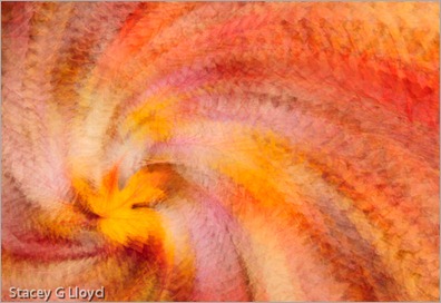
Even though the leaves may all be on the ground, you can still have fun creating great images of fall color. Just look at the ground. I went out and did just that Sunday morning. One of the final images is shown above. I started the morning practicing some creative camera techniques. Below is a sequence of images that set the stage for that above. The sequence started with a simple shot of the leaves on the ground (more on that in the next blog).

Blog_20111114_1-8

First I captured a “simple” off center 9 exposure rotational image. To do this you keep a point in the viewfinder (pick one of the focus markers in your camera’s viewfinder) set on a single point on the subject (the leaf) and rotate the camera slightly as you click off the exposures. With a Nikon camera you can setup it up for multiple exposures to be blended automatically in the camera; with other camera’s you may have to blend them in Photoshop.

Blog_20111114_1-7

Next I captured a 9 exposure zoom image. Keeping the focal point on the leaf at the same point as I slowly zoomed and clicked off the exposures. Notice there was a slight camera rotation as well. I reduced the focal length to get more leaves into the image.

Blog_20111114_1-5

Putting these two techniques together you can end up with an off center rotational zoom image like that below. Hold onto the zoom ring as you rotate the camera to do this most readily.

Blog_20111114_1-2

I then applied this same technique to the base of the tree from which all these leaves had fallen (the opening blog image). It appears the tree is drawing in all of the leaves and sucking them down into the tree’s base. This is what ultimately happens in the forest as the leaves decay and feed the tree, but not quite so dramatically. The tree is recycling…

Posted in How To

Fall Color and Textures

Blog_20111104_1-4

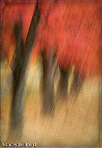
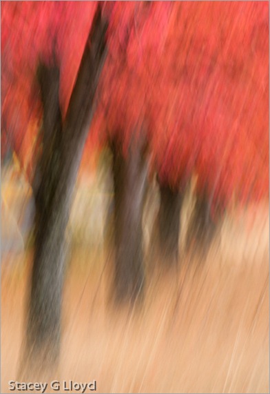
It is hard to believe that fall has come and almost gone. This past year has gone so quickly. I not only love the bright colors of fall, but all the various shades of brown the grasses and plant take on. As always, I try different techniques on any good subject I find. This row of maple trees in an abandoned business park is one example. The opening blog image was created from a swipe (1/4 sec) that then had two texture overlay layers added. Both textures are Flypaper textures. Shown below is the swipe without the added texture layers.

Blog_20111104_1

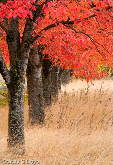
The third image is the scene shot straight at f22 for maximum depth of field.

Blog_20111104_1-3

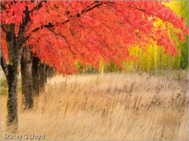
The final image is a landscape format capture of the scene that brings in more of the green in the distance trees. Shooting both landscape and portrait orientations of a subject is always a good idea; that gives you more options for possible publication or stock image use. I find I like each of these images for different reasons. Which do you like best?

Blog_20111104_1-2

Posted in Texture Overlay, Uncategorized

Flypaper Textures

Blog_20100730_1-2

In the past couple of years, the use of “texture overlays” has become quite popular (see Flickr).  Personally they appeal to me because of the painterly quality added to an image. Up until now I have only used textures that I have captured. Typically I have grabbed the texture on location (a close-up of a building’s texture for overlay on other images of the building). However, I have seen some beautiful images from Tony Sweet, John Barclay and others that use prepackaged texture images from “Flypaper Textures”. They offer several differ sets of textures which can be purchased. The quality of these textures is excellent and multiple textures can be applied to an image to make it unique. I highly recommend them.

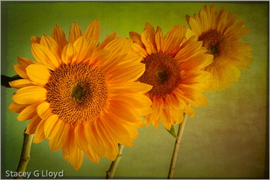
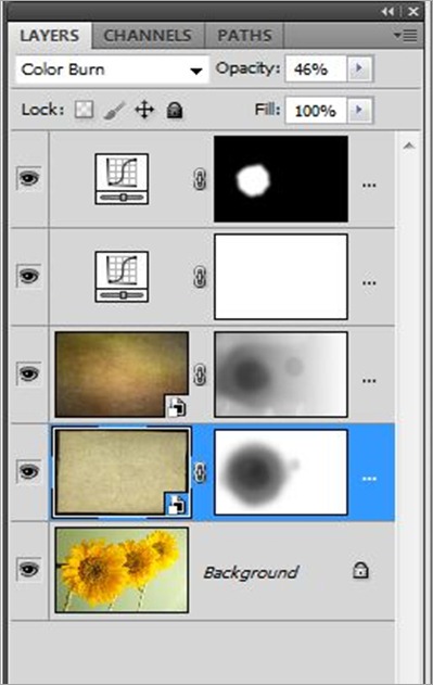
Textures can be overlaid with an image using various tools, but the most common is simply using a layer stack in Photoshop as shown below. For the sunflower image I used two different Flypaper textures. First I added the “Antiquity Scroll” texture from the Flypaper Texture Box Two collection. I blended it with the primary image using the Color Burn mode at 46% opacity to get the look I wanted. Next I added a mask to that layer and removed most of the texture from the first sunflower. Secondly I added the “Muscatel” texture from that same collection. I blended this second texture using the Multiply mode at 100% opacity.  Again I added a mask  and removed most of the texture from the left most sunflower and some from the center flower. Third, I performed an overall curves adjustment to the stack; the image was a bit dark and low in contrast. Finally, I enhanced the contrast of the left most sunflowers center using selective application of a curves layer.

How do you know what textures to use or which blending mode to use? Basically you need to experiment. Try different textures, opacities, blending modes and masks. There are also several tutorial blog entries on the Flypaper Texture Blog.

PS Layer Stack

Posted in How To, Texture Overlay

First Articles Published

Blog_20111018_1

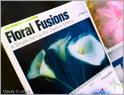
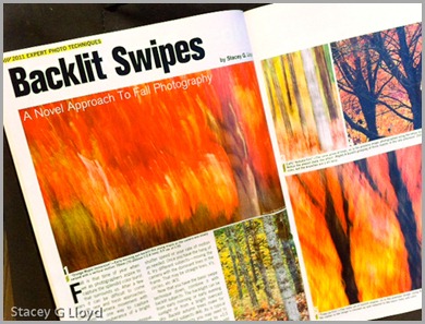
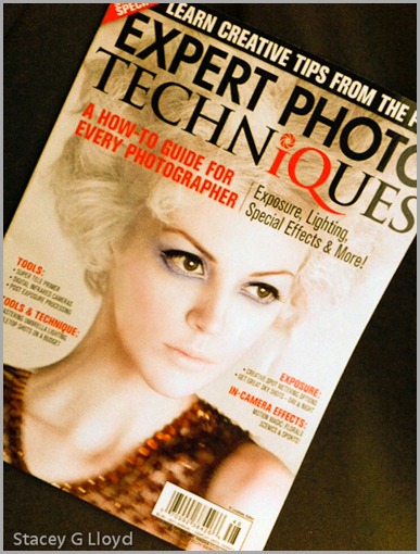
Excuse my shameful self promotion here, but it is exciting to get your first article(s) published in a national publication. In this case Shutterbug’s Special “Expert Photo Techniques”  (the cover is shown in the last blog image). The first two images are iPhone captures of the lead pages for each of the two articles. If you have been following my blog you know that both of these articles are based on work you would have seen here first.

Blog_20111018_2

In case I didn’t mention it before, these two articles were written several months apart but just happened to be put in the same issue by the editor. Both of them are “how to” articles on creating some of the images shown in my exhibit earlier this year.

If you want to pick up your own copy, you can generally find this special issue wherever Shutterbug magazine is sold. Enjoy.

Blog_20111022_3

Posted in Uncategorized

Fort Point in HDR – Revisited

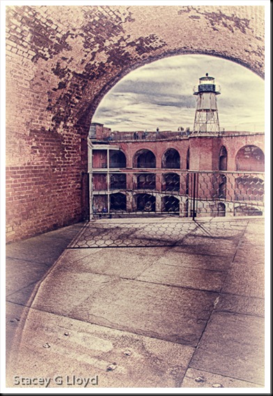
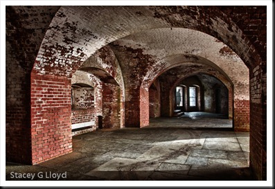
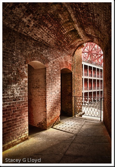
Blog_20111003_2 This past week I was able to return to Fort Point in San Francisco. Unfortunately, due to traffic I only had a 45 minute window in which to shoot before it closed. Here are a couple of images from that visit. It was a great place to photograph the first time and was again the second. If you can go there, I highly recommend it. It is the lighting that excites me when I am there; very dramatic with wonderful arches, lines and shadows everywhere. As before, I shot HDR sets to deal with the extreme light range.

Blog_20111003_1 One thing I decided after my first visit was that this place begs for people in the images. I made use of my camera’s timer to take some images where I ran out into the frame. In the image above, that is me in the window. I shot one medium exposure frame in addition to the HDR set where I stood on the steps by the window. I then blended myself into the HDR image using Photoshop layers and a mask. It looks like I am outside the window, but I am not.

Blog_20111003_3

All HDR images processed with HDR Efx Pro from Niksoftware. Additional processing was done in PS5 with other Nik Filters.

Posted in HDR Photography, Uncategorized