Fall Painting

Blog_2012-11-06_20121106_1

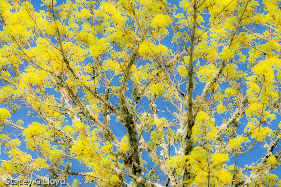
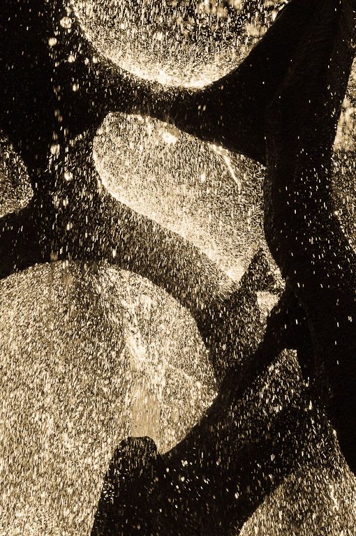
This fall, I have continued experimenting with different camera “painting” motions. In this blog I have included four different camera motions applied to the same scene. The compositions vary slightly, but this should give you an idea of the different looks that can be achieved by moving the camera with a slow shutter speed. The lead blog image was shot moving the camera in a tight circular motion – 1/3sec at f20.

As with any good image, you still need to take into account the lighting, composition and tonality of the scene. In the series of images shown here, it was just past noon with a mostly cloudy sky resulting in inter-dispersed sun breaks. This can often result in too much contrast, but with camera motion a lot of blending takes place – reducing the contrast (In fact, you will probably need to add back some of the contrast during post processing). The composition takes advantage of the trees in the foreground to create depth and some framing. The gently sloping terrain adds a nice element as well. The colors were terrific as you can see.

Blog_2012-11-06_20121106_1-2

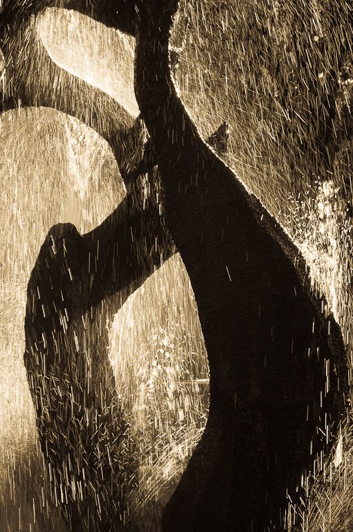
The image above was created with a shaky camera motion as I moved the camera vertically with a slight left to right motion to add a little bit of a diagonal (1/3 sec f20).

Blog_2012-11-06_20121106_2

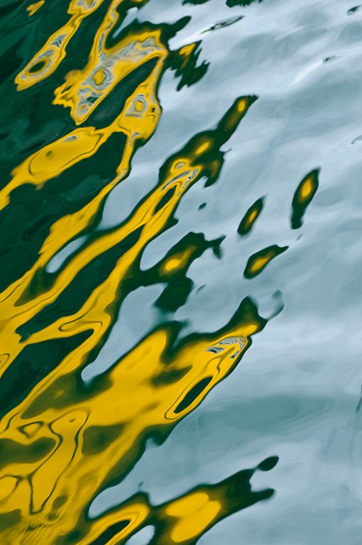
This image above was captured with a large circular motion. This results in arcs with the slightly shorter shutter speed used for this image (1/8 sec at f20). Notice that bright areas tend to erase the darker ones (the trees missing in the yellow area). You can use this to your advantage in some cases to “erase” undesirable elements in the scene.

Blog_2012-11-06_20121106_1-3

This last image was shot with a simple quick vertical motion (1/8 sec at f10). If you haven’t tried “painting” with your camera before, this is the place to start.

One last note, these images were all taken at a local business park. As I have said in the past, there are great images to be found no matter where you live.

Let me know which image you like best.

Posted in Uncategorized

Panning Waves

1 Blog T

Just after sunrise on the Atlantic ocean, I started composing images of backlit waves. First I tried raditional shots, just trying to catch the waves at the crest while freezing the action. It then occurred to me that waves might make a good candidate for panning. Using a range of shutter speeds from 1/4 to 1/2 sec I started panning the camera, tracking a single wave (just like panning on a moving car, bicycle, etc). The images come out quite painterly, a look I always like.

Shown here are a couple of my favorites.

Notes:

  1. To get this slow of a shutter speed I was shooting at f36, ISO100 with a polarizer on.
  2. The blue and gold colors were created by the morning sun combined with the shadows in the waves. 
  3. As always with this type of shot you need to practice and capture several exposures to get one good one.

1 Blog T 2

Notice how the slow shutter speed captures the spray as it shoots in different directions. 

1 Blog T 3

Below is an image shot at 1/200 of a second, f9, ISO 200. A more traditional image.

1 Blog T 4

Posted in Uncategorized Tagged , , , |

Botany Bay Plantation Boneyard

1 Blog T 2

Ever since I saw Tony Sweet’s images of the boneyard off Edisto Island in South Carolina I have wanted to do a sunrise shoot there. A boneyard in this case is a place where there are dead trees along the beach with some standing in the ocean during high tide (due to erosion of the coastline). They are great for creating simple minimalist images – especially at long shutter speeds (several seconds). It turned out that clouds moved in during the night and I didn’t get the sunrise colors I had hoped for, but it still worked out quite well – there were nice dramatic blue-grey clouds.

 1 Blog T 3

Here are a few pointers on shooting this type of image:

  1. To minimize the texture of the water, use long exposures. 
  2. Your tripod will be in the water so make sure it can handle the salt water and sand. My carbon fiber tripod (Gitzo) does quite well. Just rinse it with tap water afterwards and clean as necessary.
  3. Waves will tend to undercut your tripod legs and move the camera during the exposures. To minimize this, let a couple waves come and go before exposing (adjust your framing as necessary) – this lets the legs get somewhat settled into the sand.
  4. Shoot several exposures to get one sharp one.
  5. To create lines moving into the image, wait for the wave to reach its furthest point up the beach before opening the shutter. 
  6. Use a wide angle lens to accentuate the lines created by the receding waves (see the third blog image below).
  7. Collisions between incoming and outgoing waves can create interesting patterns (see the opening blog image).
  8. Try several exposure lengths to get the effect you desire.
  9. Notice where the white water stops. This will create a strong tonal line in your image. Make it work for you in the composition – use it diagonally (as shown above) or place straight at a 1/3 frame line as shown below.

1 Blog T

This last image was take by another photographer I met that morning, Stephan Frasier. It gives you a clear overall image of the shooting situation.

 Stacy 7025

Posted in Composition, How To Tagged , , , , , |

Photographic Challenge – Rocks

Blog DSC1758

When traveling on the road I often get up wherever we are and take a walk in the early morning light. I usually take my camera with me. Today, we were camped along part of the Yellowstone river (but not in Yellowstone NP). As I anticipated the night before, the sun was rising behind us so most of the area was in shade. What I did see was a lot of river rock. I decided to challenge myself  and see what images I could create using this river rock.

Blog DSC1730 

 In some respects this can be like calisthenics for photographers . Here are some of the images I came up with.

The opening blog image used a variable ND filter to take a 3 sec exposure of the waves off the river rippling over the rocks. I found that longer exposures smoothed the water out too much and you would loose the wonderful painterly texture.

This next image is a straight shot looking for a nice composition amongst all the chaos. The grouping of three rocks attracted my attention.

Blog DSC1709

Here is this next image that I converted to B&W in Lightroom, a single larger rock stands out. I placed it tight in the corner to create a sense of loneliness even though it was surrounded by other rocks – a conceptual image.

Blog DSC1711

Below I applied a technique I usually save for flowers. This is an off axis 9 shot exposure while zooming and rotating the camera. It does create an interesting image when applied to rocks.

Blog DSC1729

A rusty old wheel well provided this next abstract image.

Blog DSC1764

Using the variable ND I shot 15 sec exposures as the morning sunlight started hitting some of the rocks. The challenge here was to find pleasing compositions in the rocks. 

Blog DSC1750

A piece of rusty metal place within the rocks creates yet another abstract image.

Blog DSC1717

Try challenging yourself. Start with a “non-photogenic” setting and see what you can create – use your imagination, try things you never have before.

Posted in Technique Tagged , , |

Waiting for the Light

Photo Snapseed

To be honest, I am not one who usually likes to just sit and wait. But with photography, the two most important elements in a great photo are the light and the composition (assuming the technicals are fine). When it comes to landscape photography, being there when the light is special adds a lot to the image. This usually means being out there early/late or in inclement weather looking and sometimes waiting for that magical light. I was reminded of that this past week as I walked by a building in thenSilicon Valley area that was sculpted with flag stone. It was 7pm and the sun was just coming around the building at such an angle that it skimmed just patches of the flagstone. Unfortunately my iPhone was dead and I didn’t have a camera. The next evening, I was in the same area so I took the time to wait and watch for the magic to happen again. While I was waiting I noticed a heart shaped structure in the flagstone. As luck would have it, the sunlight skimmed those stones and image shown hear was the result. The iPhone image was processed with Nik’s Snapseed to add a vignette and some drama to the image.

Posted in iPhoneography, Light

Hosta Image Play

Blog_20120529_1

Every now and then I like to play with an image and look at what variations evolve. The lead image is the final result of last night’s play. Before I write about the steps I took, I would like to address the composition. The Hosta leaves shown here, are just a few on a very large plant. I walked around and around the plant looking for a pleasing composition. Here are some of the considerations that went through my head as I framed this image: a focal point for the eye to rest (notice that only one leaf is mostly visible (about half of most leaves are in the frame); a nice flow (note the diagonal motion); where to place the focal point (the rule of thirds); nice placement of the water drops; soft lighting that still brought out the leave texture, etc. The original image is shown below and it came out quite well as is.

Blog_20120529_1-4

In the “lightroom”, I started off thinking I would create a sepia toned version. My past experience had shown that to be real nice for foliage like this. The image was brought up in Niksoft’s SilverEfx Pro and I started clicking through the presets. I found a look I liked but removed the framing and added a soft vignette. Tweaking the contrast and structure I achieved a nice overall look. Several local adjustments were then made to bring out the drops on the main leaf and address a couple minor distractions. The result is shown next.

Blog_20120529_1-2

I considered stopping at this point as I was happy with the result, but then I remembered I captured a couple color wash images (flowers and foliage totally out of focus) and decided to try them out on this image. The wash is shown here.

Blog_20120604_1

I actually placed the color wash “under” the image and then blended it with the Sepia toned image using the “Overlay” mode in Photoshop. This is what brought most of the unusual coloring to the final image. Finally, to give the image a little more of a painted look I blended in a “Flypaper” texture called “Nora Batty” in the overlay mode with a hand brushed mask. The Photoshop layer stack is shown below.

Capture

We have all kinds of tools at our disposal in today’s digital photographic world. Let your mind run free and play as a child would. You will be amazed at what can come from within. The tools just allow you to capture what your mind can imagine. The more you play, the more you will know the tools and be able to create those “what if” images. Have fun.

Posted in Uncategorized

Orton Derivative

Ponderosa

I am always looking for new ways to express my artist vision. Recently I decided to create a selective blend of an Orton style image with the original. An Orton image is typically a blend of a “straight” image with an out of focus version. The out of focus version can either be created using Photoshop (by applying a Gaussian blur) or in the field. I typically create the out of focus image in the field. When you do that you need to remember to open up the f-stop to minimize the depth of field, overexpose 1-2 stops and switch to manual focus so you can defocus the image. For more examples of the Orton Effect search my blog for “Orton”.

Note that while the technique adds a nice look, the image works well because of the nice morning light.

Blog_20120430_2-2 

Above is another example of an image applying this technique. Below are the two source images along with the Photoshop layer stack.

Blog_20120430_3

This is the straight capture: f18 at 1/8sec.


Blog_20120430_1

Here is the out of focus capture: f2.8 at 1/125sec.If you don’t have this second image, you can create it in Photoshop by duplicating the original image, adding a Gaussian blur and applying a “Screen” using the “Apply image…” in the “Image” pull-down menu.


Photoshop Layers

Notice a couple of things about the layer stack. First, the out of focus image is placed on top of the straight image and blended using normal mode – 89% in this case. Second, a mask layer was added and the tree trunks were masked using a brush whose density is less toward the edges (to better blend the images). Third a curve adjustment layer was added to improve the blacks, whites and the overall contrast.

Have fun.

Posted in Uncategorized

Around the Yard

c66-Blog_20120422_1.jpgBlog_20120415_8.jpgc53-Blog_20120422_5.jpgc13-Blog_20120422_4.jpgc48-Blog_20120423_3.jpgc87-Blog_20120415_7.jpgc99-Blog_20120415_6.jpgc65-Blog_20120422_2.jpg
 

One thing I love to do in spring is get up early on a Saturday morning and just roam around the yard and look at all the emerging life. Sometimes I walk around with my camera and just see what beautiful art can be found. Here are a few of the images I captured on a couple mornings.

Posted in Uncategorized

Abstracts

Lloyd_Stacey_1Stair Shadow Play.jpgLloyd_Stacey_2Stairs on End.jpgLloyd_Stacey_3White Memorial Fountain 1.jpgLloyd_Stacey_4Ghosts in the Deep.jpgLloyd_Stacey_5White Memorial Fountain 2.jpg
Abstract photography is about capturing pattern, light, color and texture to create designs. The hand full of images shown here are a set of abstracts I recently entered into the PhotoPlace juried competition in Vermont. This time one of my images was selected for the online gallery and exhibit book (the White Fountain Memorial #1 image).

You can see additional images from the exhibit here. There is a very nice set of abstract images there and you may find many of them inspirational to creating your own abstracts.

If you would like to purchase one of the book compilations from this exhibit you can do so here when they become available ($24.95).

Posted in Composition

Rays of Sunshine?

Blog_20120404_3

I posted a Facebook entry recently where I applied a new iPad app called “Rays”. In this blog entry I will go a little more in depth and show how I applied Rays to another image in my catalog – the result is the lead blog image.

Walk Into the Light

The original image is on the left – before applying “Rays” . It is a B&W HDR image processed with Nik’s SilverEfx Pro. I selected it because it is a high contrast image with a strong white area; an area where it seems plausible for light rays to emanate.

I transferred this image to my iPad where I could apply the Rays app. Now the fun begins. The first thing you will want to do is slide the “Brightness” slider to the right until you can easily see the light rays. Next you will want to Blog_20120404_1place the point from which you want the light rays to radiate. In this image I placed the little round circle that denotes the light source in the upper left corner where the sun actually was when I captured the image.

I would suggest that next you try adjusting the “Threshold” slider. This slider determines the highlights from which the app will create rays – from just bright white areas to light shades of gray. Adjust until only the areas you want emanating rays are doing so.

Blog_20120404_2

After that try adjusting the “Length” slider. It does just what you would think – control the length of the light rays.

There are three other adjustments you can make to get the look you want: the “Ray Opacity” and “Source Opacity” sliders and the ray color selection box.

The 2nd image is the resulting image from  Rays. Notice however there is a problem. The rays are overlapping the large rocks in the lower right-center of the image. That area should be in shadow. To correct that I opened the new “Rays” image along with the original image in layers using the PhotoForge app. I was then able to paint a mask over the areas I didn’t want to see rays. The result is the third image. I made one more adjustment in Nik’s Snapseed on the iPad. I felt the face of the rock where the light was hitting was a bit too light. I added a selective control point and slightly reduced the brightness and increased the contrast to bring out the rays. The result is the top blog image.

I am looking into taking things a bit further by adding a little graduated fog using Nik’s ColorEfx Pro (back on my Mac). This might make the light rays seem even more plausible. With all the tools of the digital age, your imagination can explore all kinds of imagery. Have fun.


Posted in Uncategorized