As we jump into the holiday season, it comes time for me to give the family ideas for Christmas gifts. I don’t know about you, but this is always somewhat difficult for me. In part due to the fact that most photographic equipment is expense or things you may not want others purchasing for you. In the end, most of my Christmas lists end up being a selection of some misc gear that I haven’t gotten around to purchasing, new LCD protectors, filters, etc. Sometimes the list may contain a print from a favorite photographer. Finally there is always a list of books of DVDs from photographers whose work I admire.
Last year one of the gifts that I received was Tony Sweet’s “Visual Literacy” DVD set. This DVD set later won a Telly award in the How-to/Instructional category (some 13,000 submissions for that). I have enjoyed this DVD set and viewed many section of it several times. This DVD set gives you an intimate look at the many aspects of a fine art photographer’s day to day work. It covers shooting in the field, shooting in the studio (flower work), post-processing the images, printing, how to get started, what equipment Tony uses (and you need), etc. The most valuable part to me are the how-to pointers and tid-bits Tony provides through out the videos – things I always wondered about.
I have added a pointer to this DVD at Amazon on my favorites list in my blog sidebar. It my make a nice addition to your Christmas list.
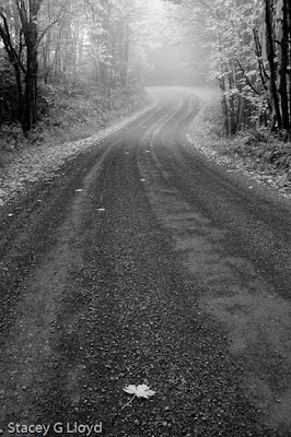
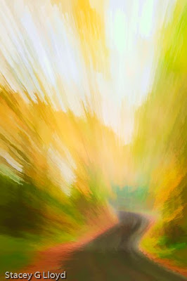
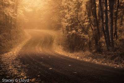
 I haven’t been inspired to write a lot this past week, but I did manage to find some late changing maple and oaks trees yesterday which allowed me to add to my Fall Immersion portfolio. Again for the first image I took advantage of morning back lighting to create wonderful colors and “brush strokes” . In the second image I used a slight scallop side movement to create the strokes.
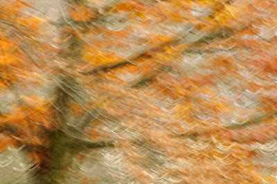
 I have been sick most of this week and so I haven’t been outside to grab the end of the fall season shots I had planned. Instead I have played a little in the office with things I have brought indoors for some close up work in the past weeks. Here are a couple shots of decayed Chinese lanterns taken on sheets of paper using a focused beam flashlight as the source. In the first shot the paper is actually white but taking advantage of the flashlights (and not auto-white balancing) inherent color I ended up with a very warm background. In both images I chose to go with diagonal shadows to create more dynamic images.

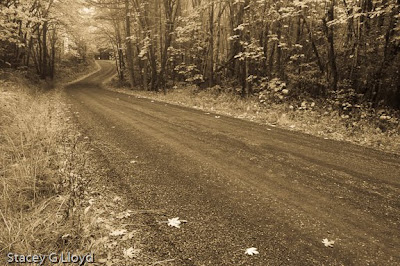
 I have been busy the last few days working on new images for my “Fall Tapestries” portfolio. For this project the number of images is restricted to 10 image total. It has been quite difficult trying to edit down to that limit -which images should be added and removed to create more depth while maintaining or increasing the overall quality of the set. I have included some of the candidates here in the blog.


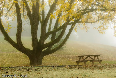 The second and third images present much more pleasant surroundings. I have found these images make the viewer wish they were sitting there and really draws the viewer into the image. Sometimes an empty bench may make the viewer feel loneliness.
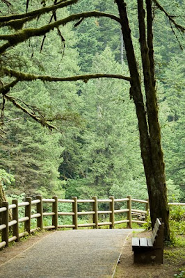 What are some other strong symbolic elements you have seen used? Note, that some symbols may have emotional ties for you but not others.


 The second image has a more subdued, moody and mysterious feel. Analysing this image: